Elas
Construction Platform
Elas is a powerful platform that provides custom software solutions for enterprises, focusing on building complex ERP systems to improve efficiency and streamline operations. By combining traditional methods with modern technology, Elas helps businesses adapt to changing needs.
Role
UX Designer & Research
Timeline
4 months
Team
PM. 6 Eng Team, 2 Designer
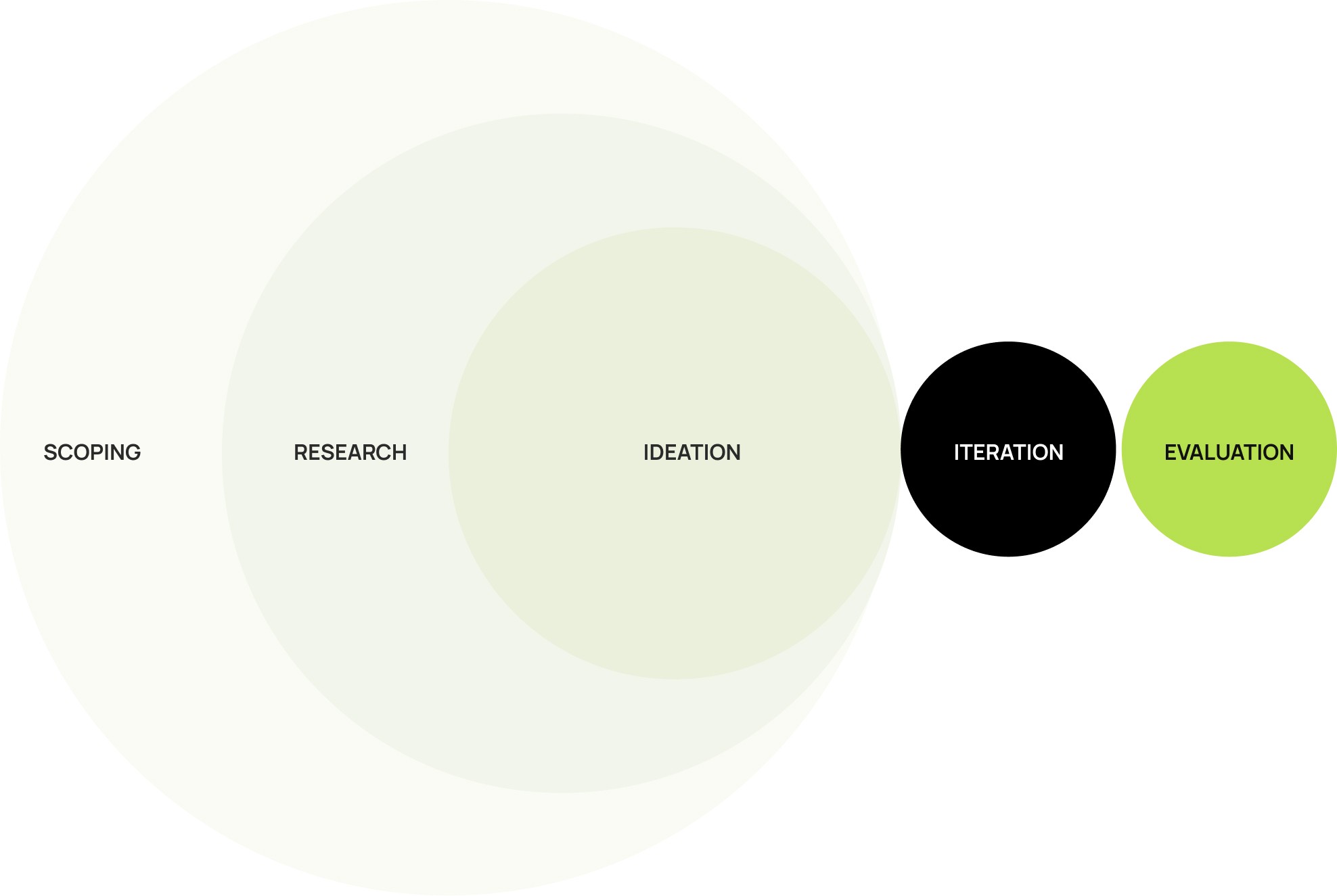
Process
But How
did I get here?
But How
did I get here?
HMW Statement
How might we simplify workflows and reduce cognitive load for construction teams managing complex projects?
Start with “5W and H” framework (Who, What, Where, When, Why, and How)
To better understand the challenges users faced on the old Elas platform, i applied the “5W and H” framework. This helped us focus our research by asking key questions.
With the new ELAS redesign, adding people became quick and effortless. What used to take minutes and 32 form fields now takes just a few clicks. Managers save almost 80% of their time, and the experience feels faster, clearer, and far less overwhelming.
94% faster team onboarding
Before
After
Problem
Problem
Business goal
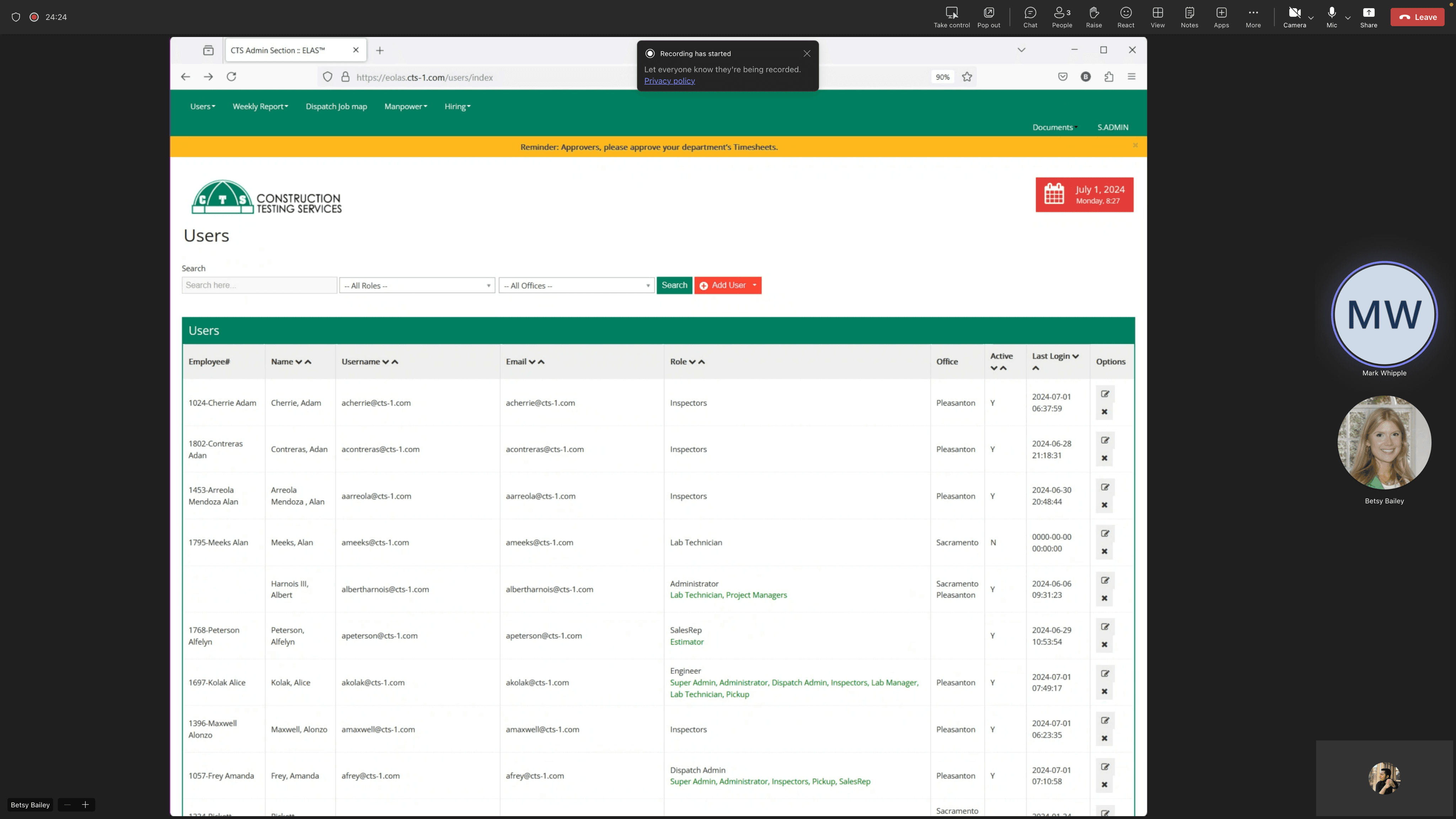
the manager spent nearly four hours just to add around 100 people. During this process, many users also felt confused navigating the platform, struggling to find basic functions. This not only delayed other important tasks but also highlighted how a lack of clarity and efficiency in design can slow down an entire construction workflow
WORK PROTECTED BY NDA
Due to confidentiality agreements, I’m unable to share detailed designs or the full process for this project. However, I’d be happy to discuss my role, approach of the Elas design—just reach out!
WORK PROTECTED BY NDA
Due to confidentiality agreements, I’m unable to share detailed designs or the full process for this project. However, I’d be happy to discuss my role, approach of the Elas design—just reach out!
Questions
User Interviews
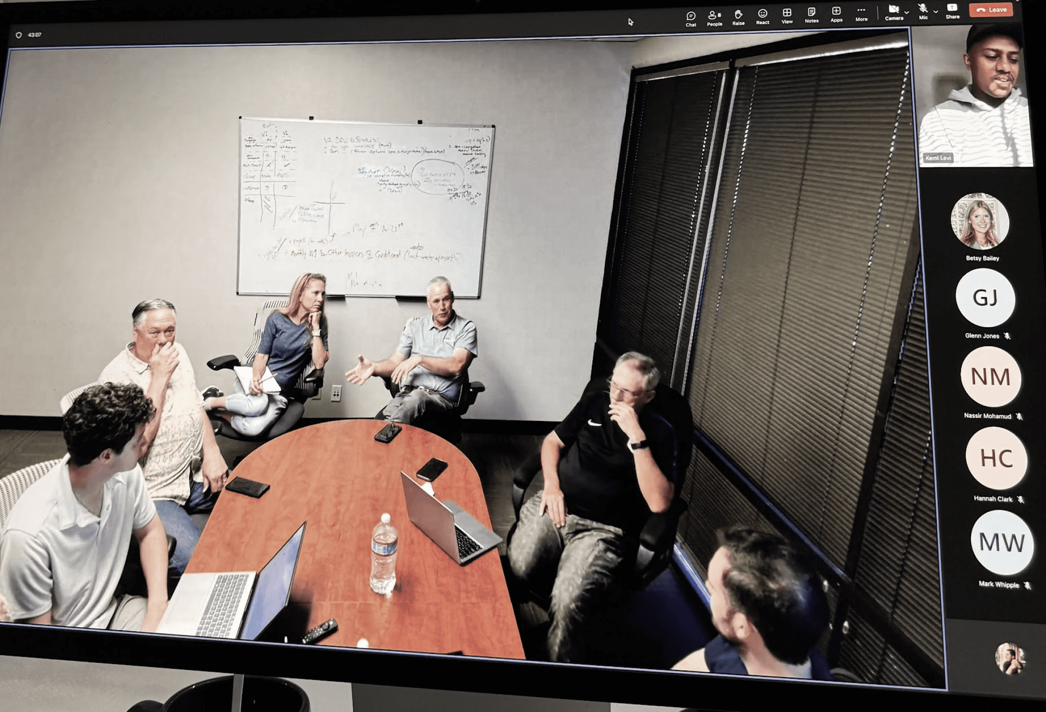
I conducted semi-structured interviews with 5 professionals across different roles in the construction industry.
Questions
User Interviews
I conducted semi-structured interviews with 5 professionals across different roles in the construction industry.
What are your daily tasks on Elas?
What challenges do you face while managing tasks and reports?
How do you track project progress and approvals?
What features do you use the most, and which ones feel unnecessary?
What slows down your workflow or causes frustration?
I assigned users tasks such as creating new “email templates” on the settings page and adding new users to the platform from the “Manage My Org” section and record their behaviors .
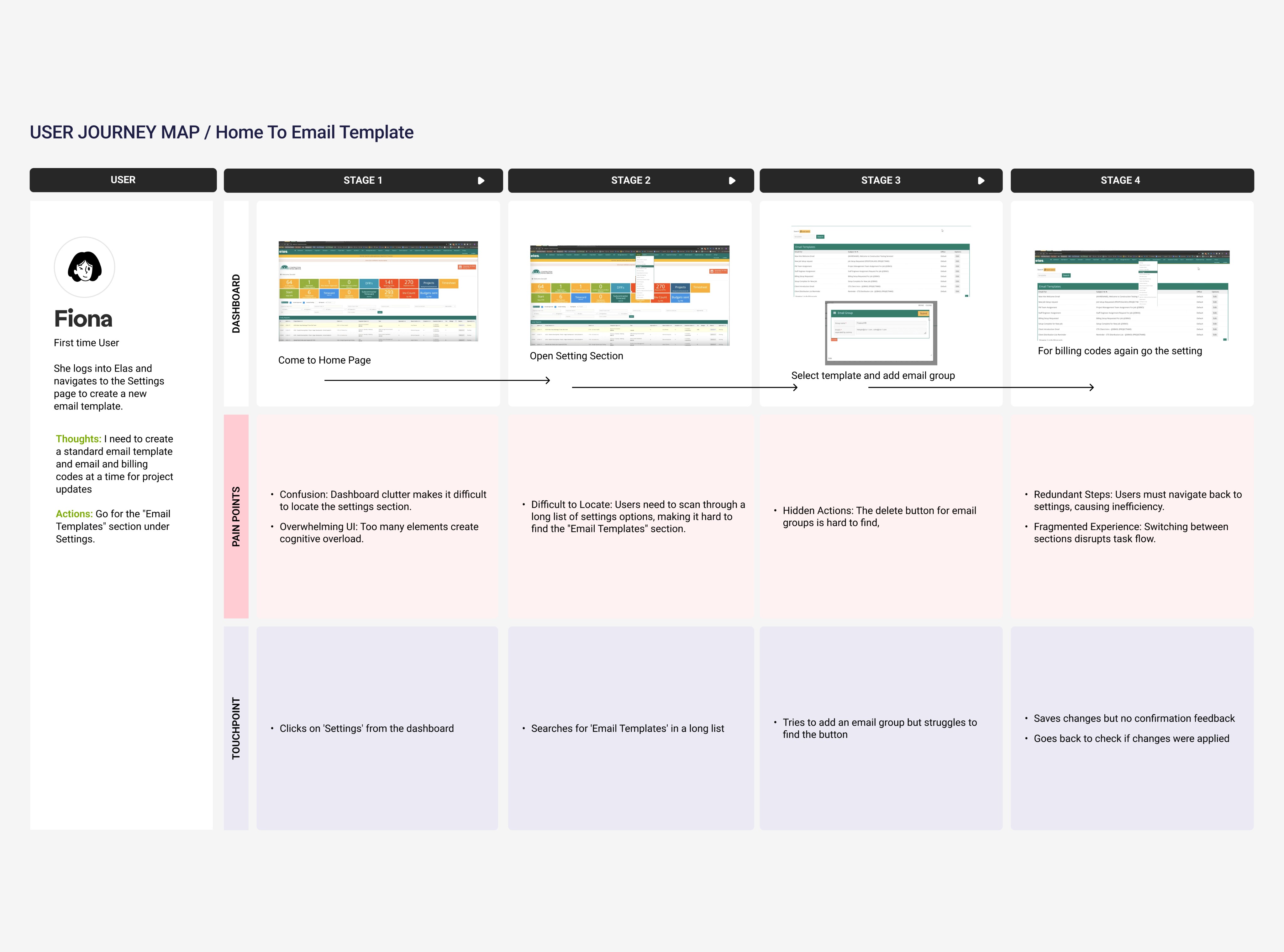
Users struggled to find key actions due to cluttered top navigation.
Simple tasks like timesheet approvals required too many steps
Tracking project progress and pending reports wasn’t straightforward.
No pre-filled templates or automation slowed down task completion.
Those interviews gives me to identify four significant pain points.
Overcrowded Interface with Information Overload
Time-Consuming Workflows
Lack of Visibility
Manual Data Entry Issues
1
2
2
4
4
3
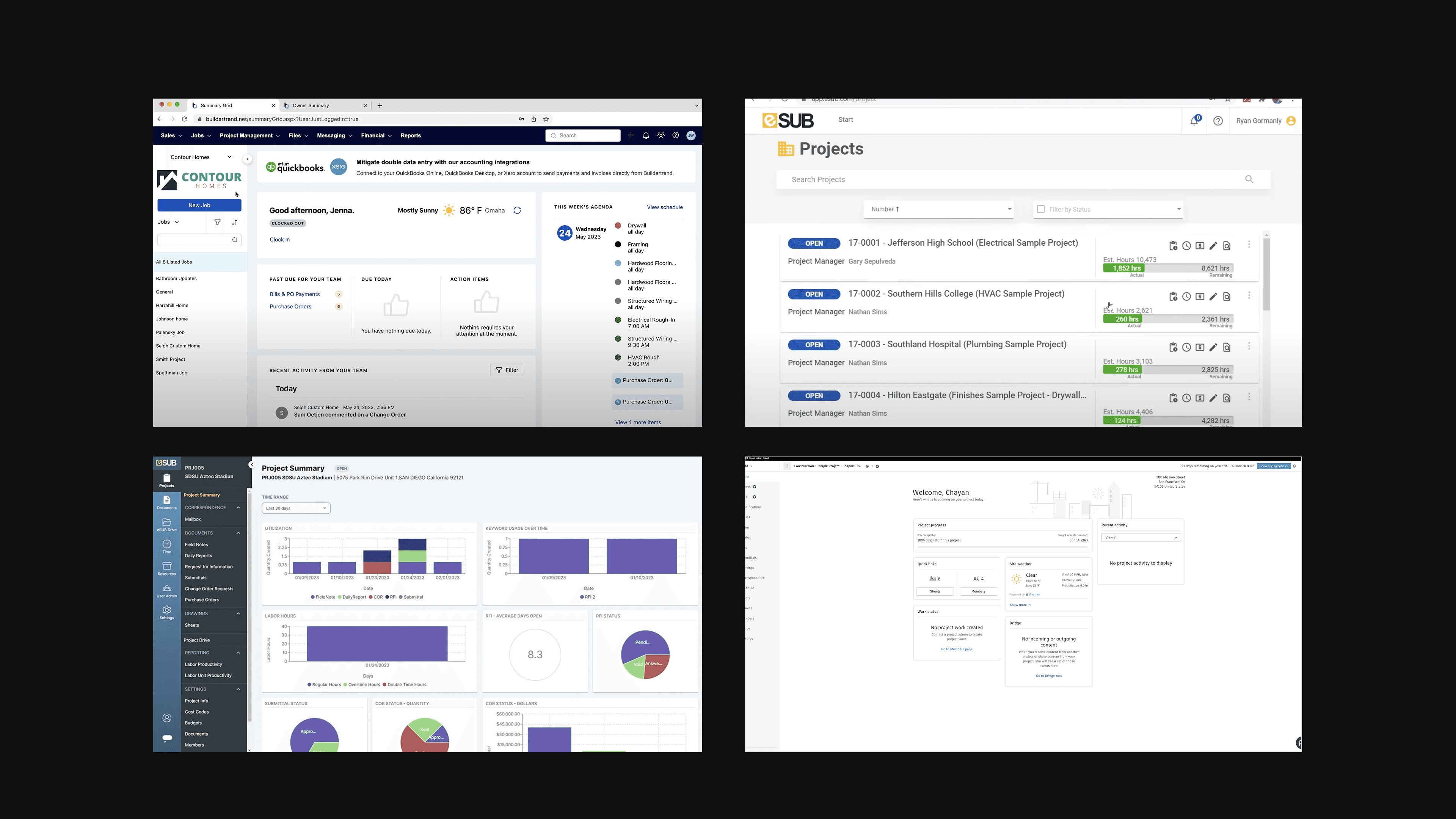
Competitive Audit
Efficiency & Usability in Construction Management Platforms
To better understand industry standards and identify opportunities for Elas, I analyzed leading construction management platforms. My research aimed to:
Identify key features that enhance usability and task efficiency.
Pinpoint gaps where existing solutions fail to meet user expectations
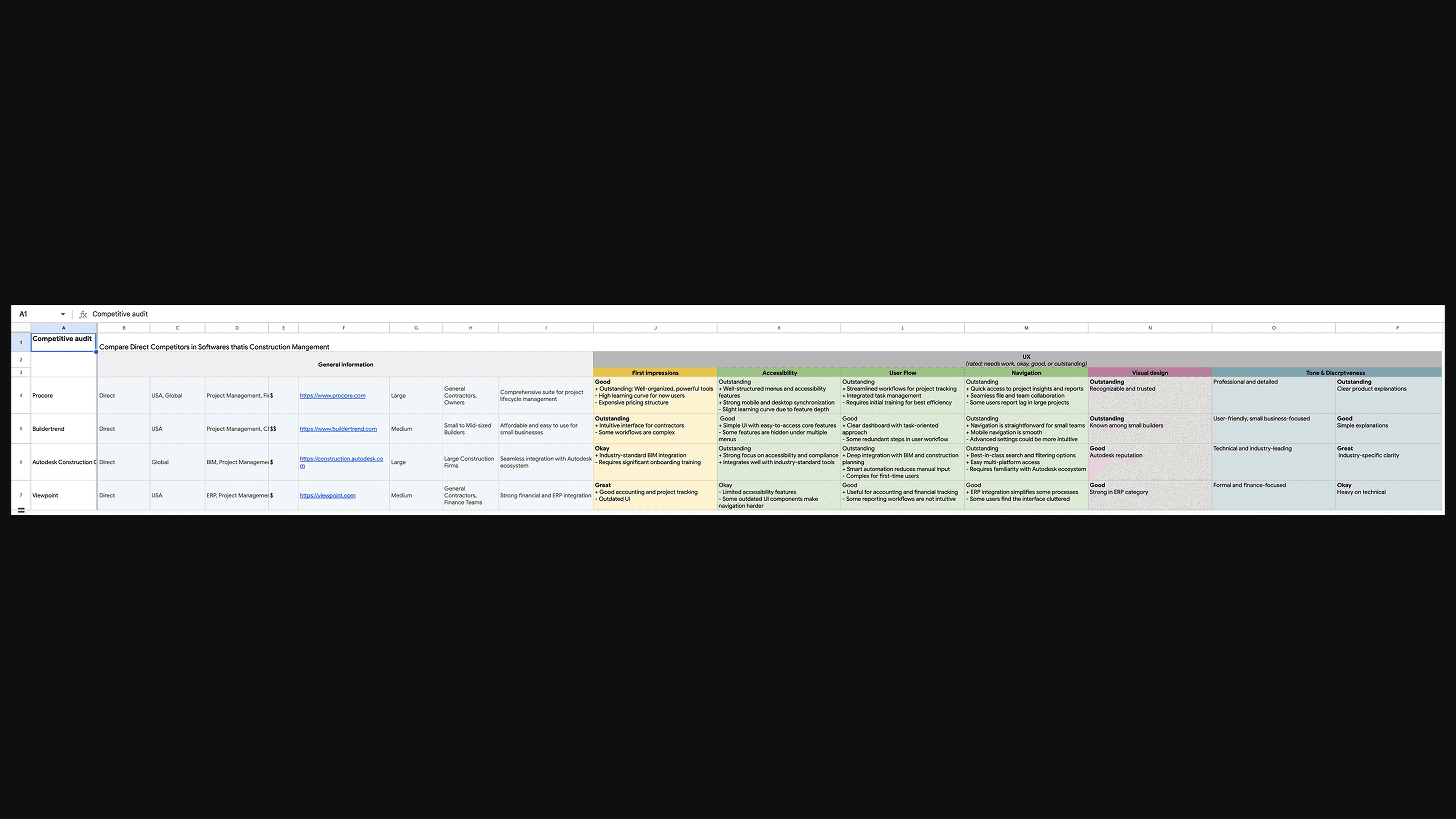
Competitive Audit
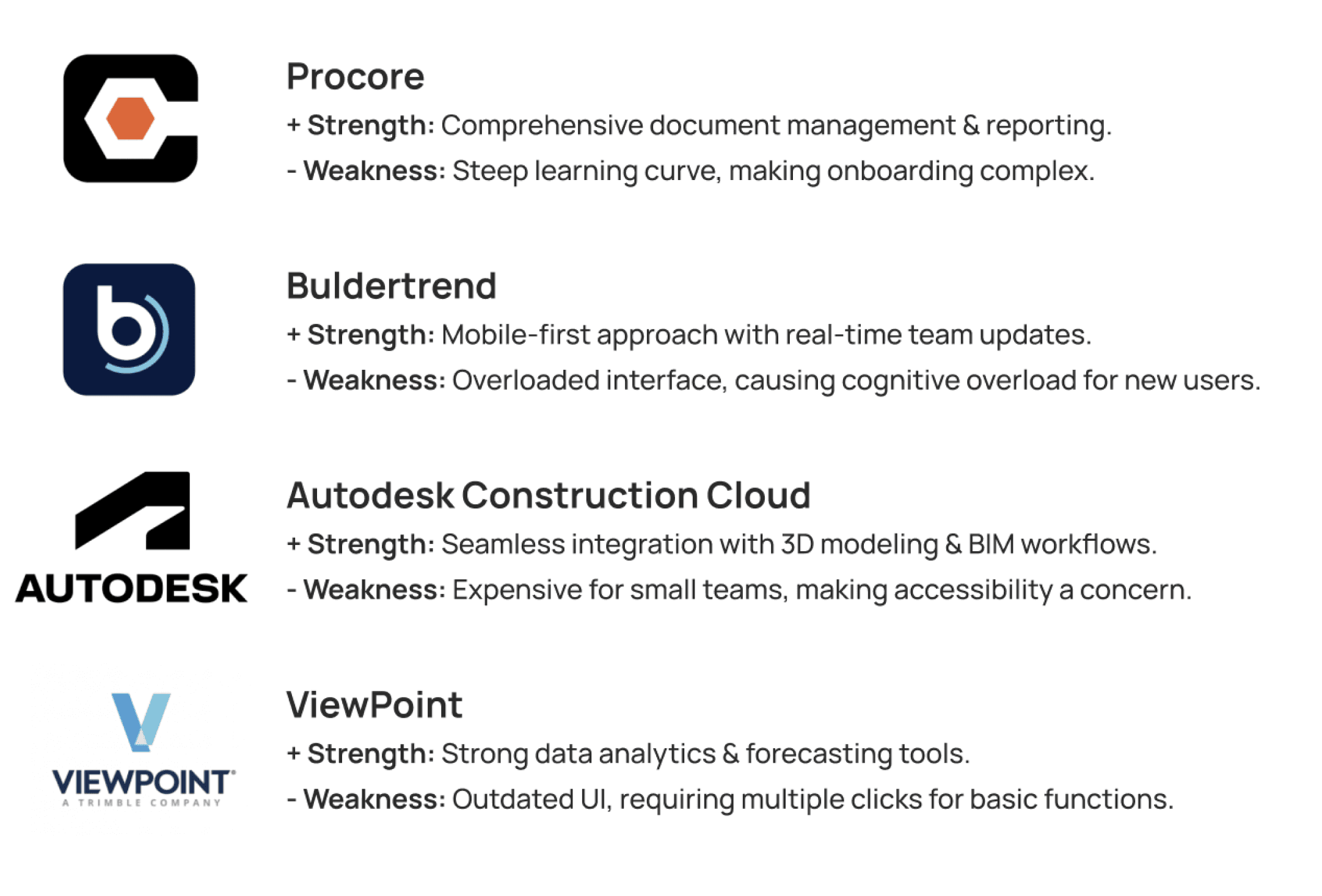
TAKEAWAYS
Based on the competitive audit, I analyzed the strengths and weaknesses of major platforms:
Competitive Audit
TAKEAWAYS
Based on the competitive audit, I analyzed the strengths and weaknesses of major platforms:
Gap
Identifying the Market Gap
None of the competitors offer a truly seamless experience combining efficient customizable workflows, and intuitive role-based controls.
After identifying this market gap, I revisited my user research and key pain points. I then began exploring how to use these insights to shape my design.
Gap
Identifying the Market Gap
None of the competitors offer a truly seamless experience combining efficient customizable workflows, and intuitive role-based controls.
After identifying this market gap, I revisited my user research and key pain points. I then began exploring how to use these insights to shape my design.
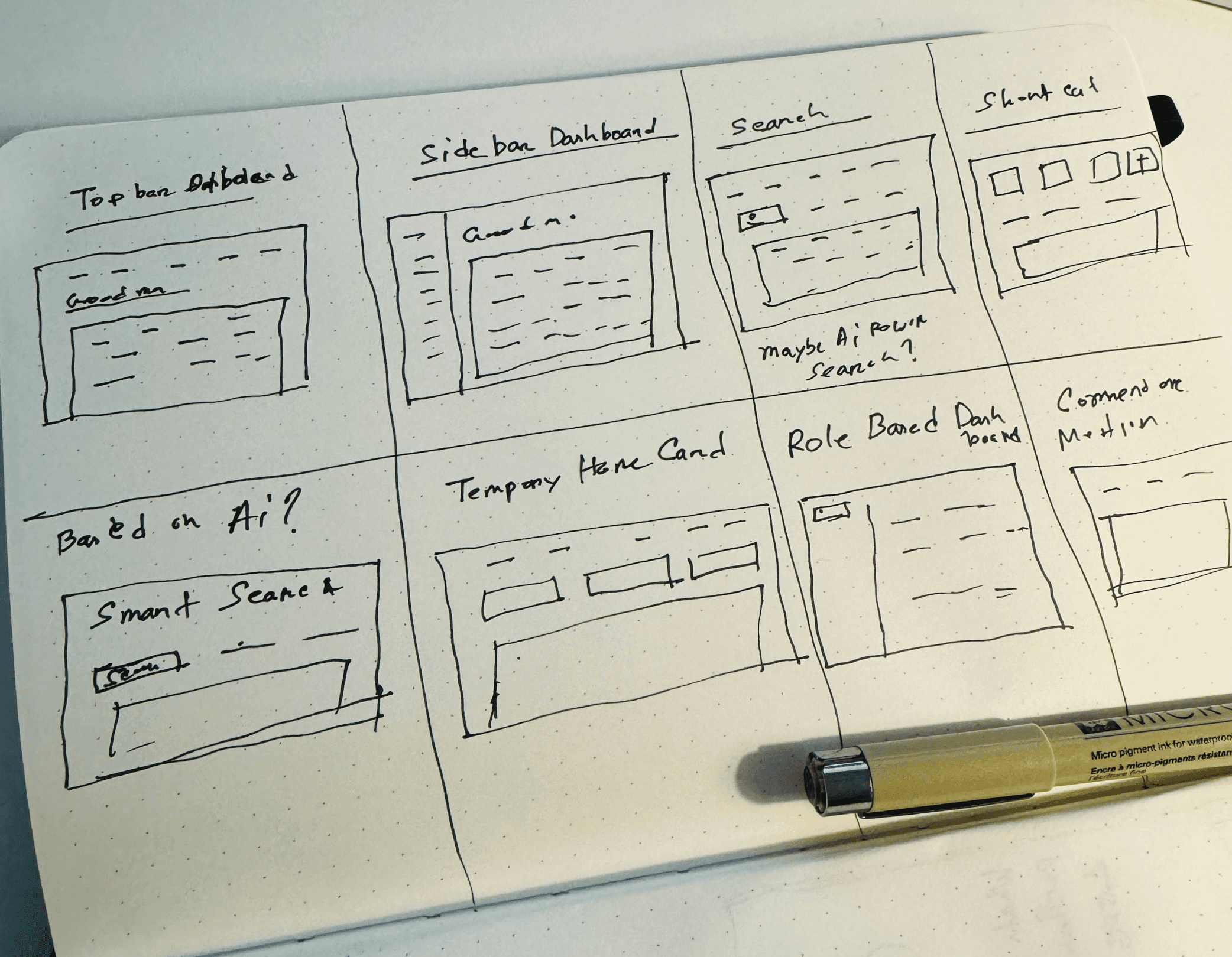
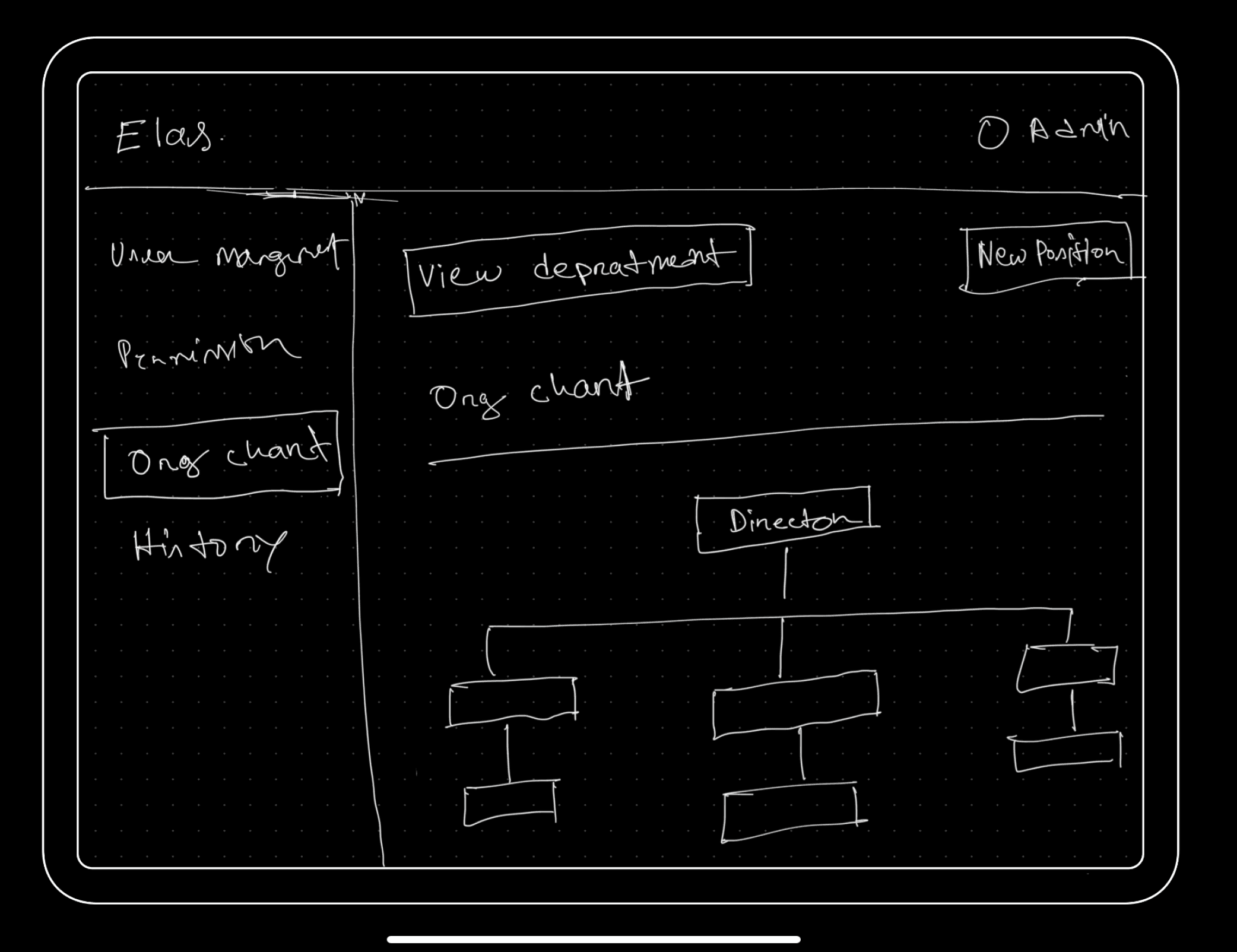
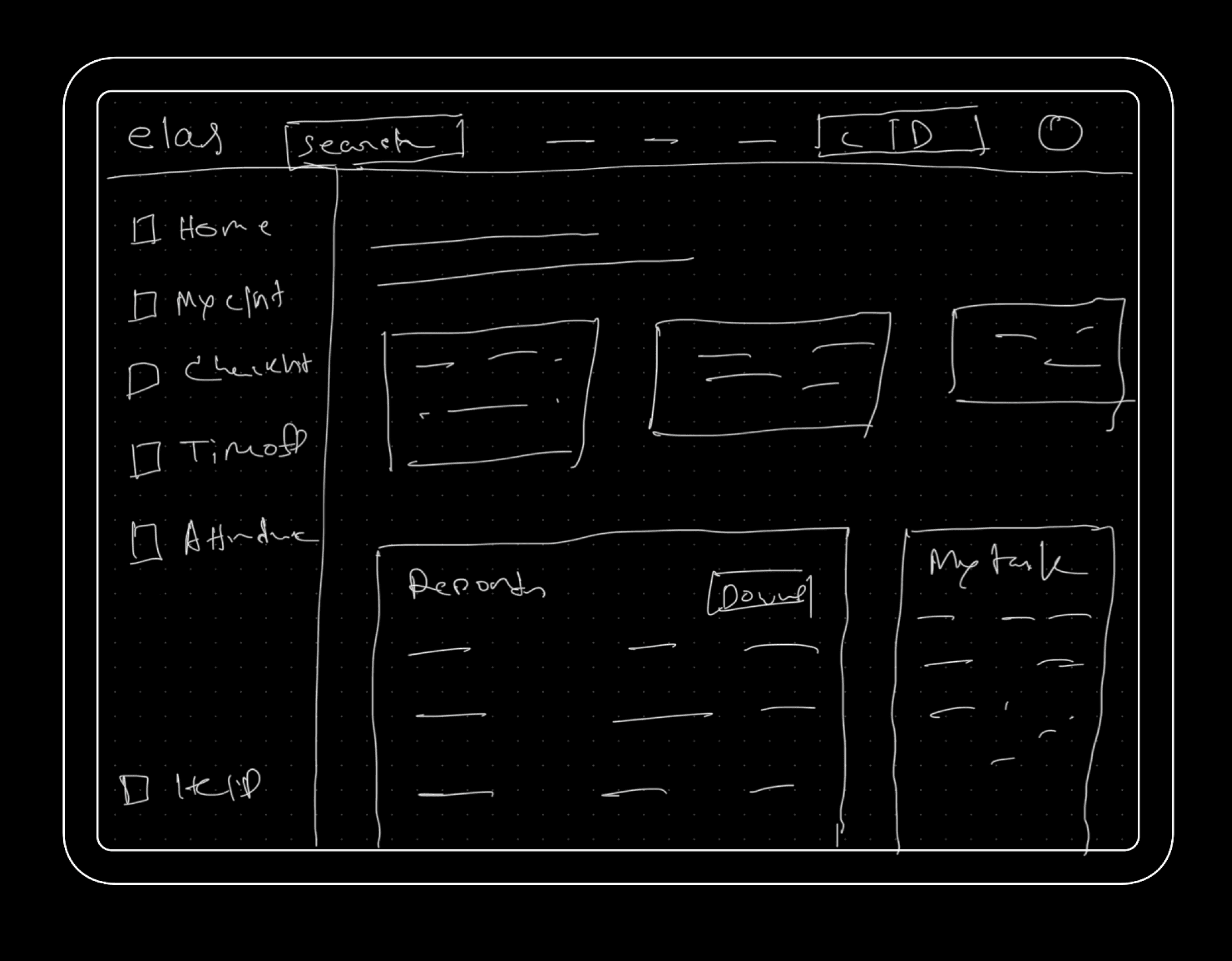
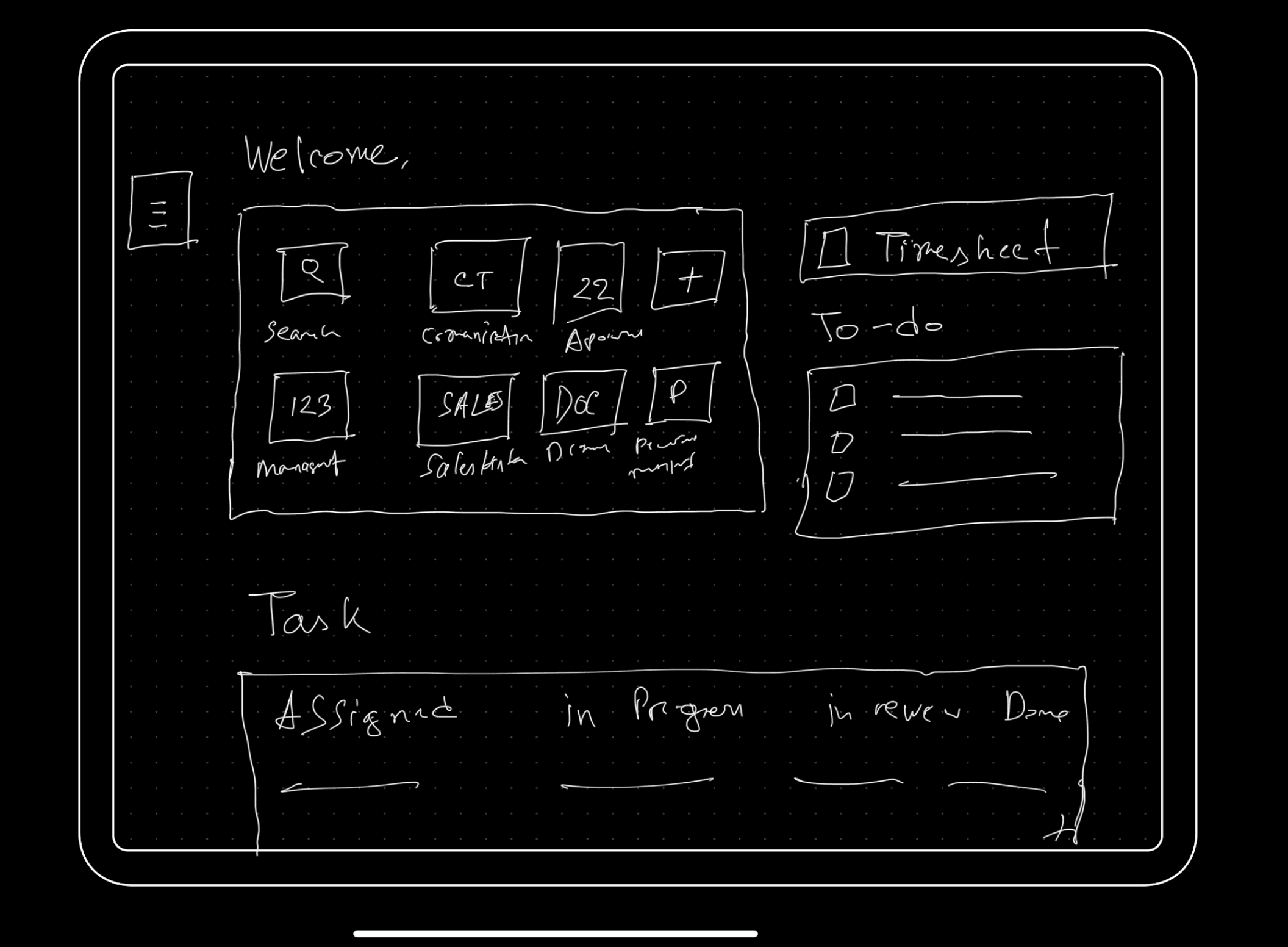
Ideation
Start with Rough Sketch
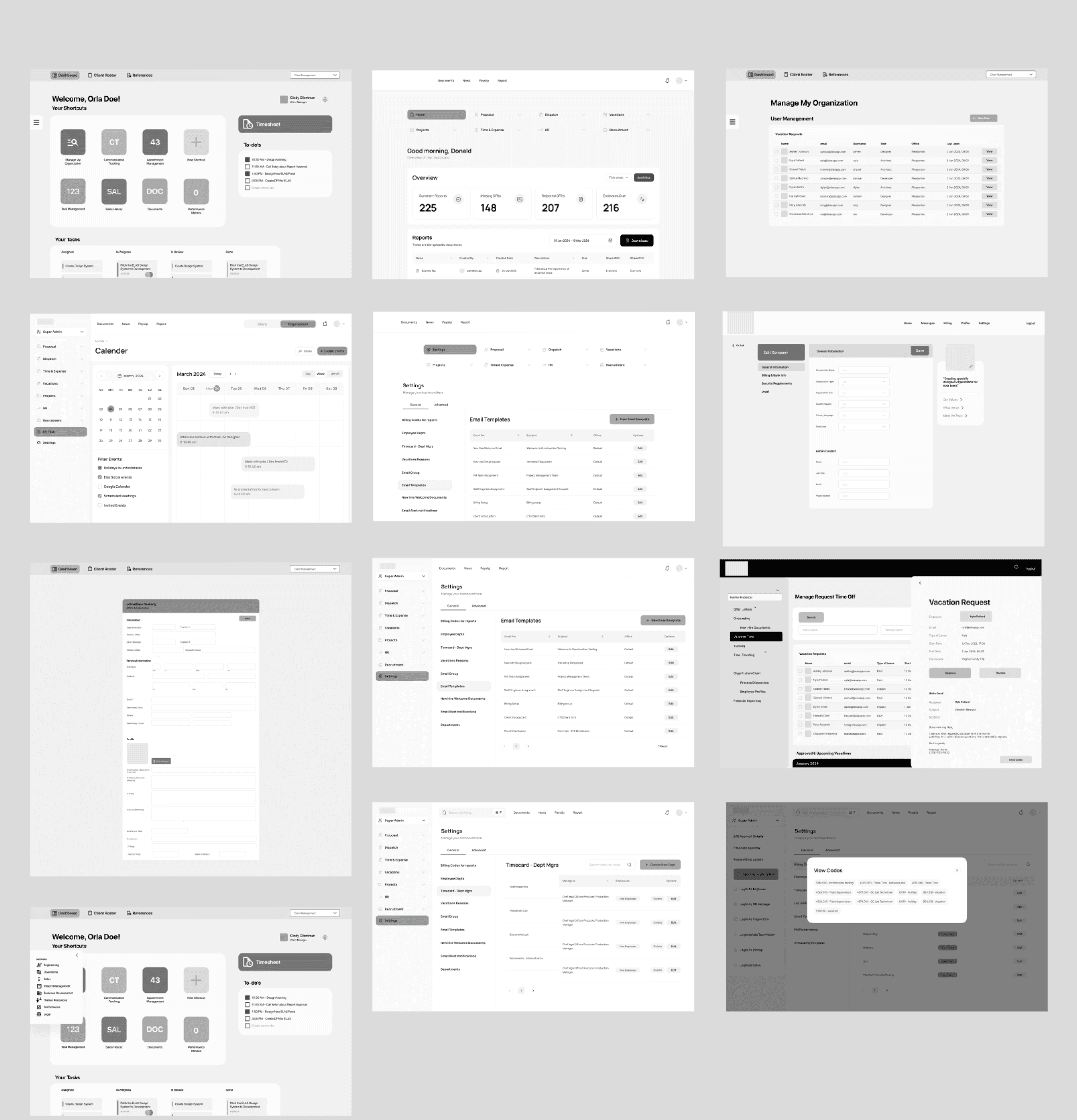
To address usability challenges, I explored multiple layout concepts through rough sketches. The primary focus was on streamlining navigation, improving task discoverability,
Ideation
Start with Rough Sketch
To address usability challenges, I explored multiple layout concepts through rough sketches. The primary focus was on streamlining navigation, improving task discoverability,
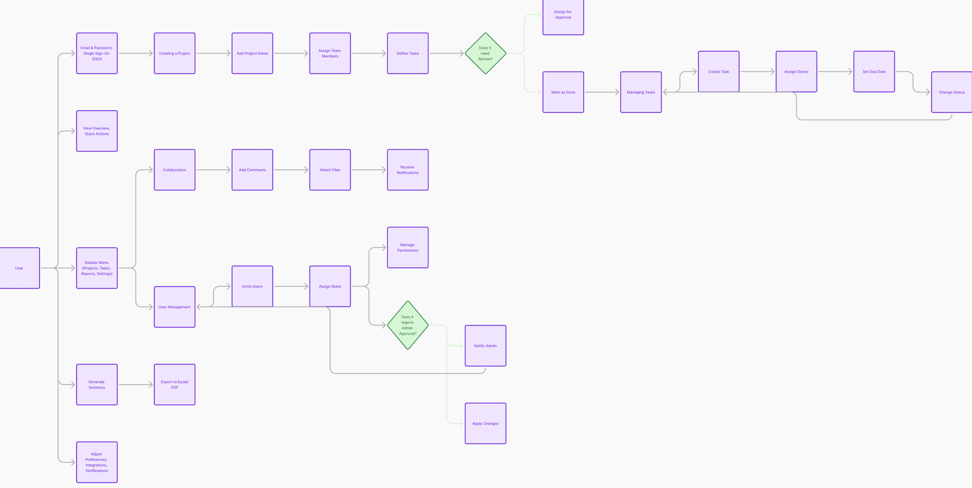
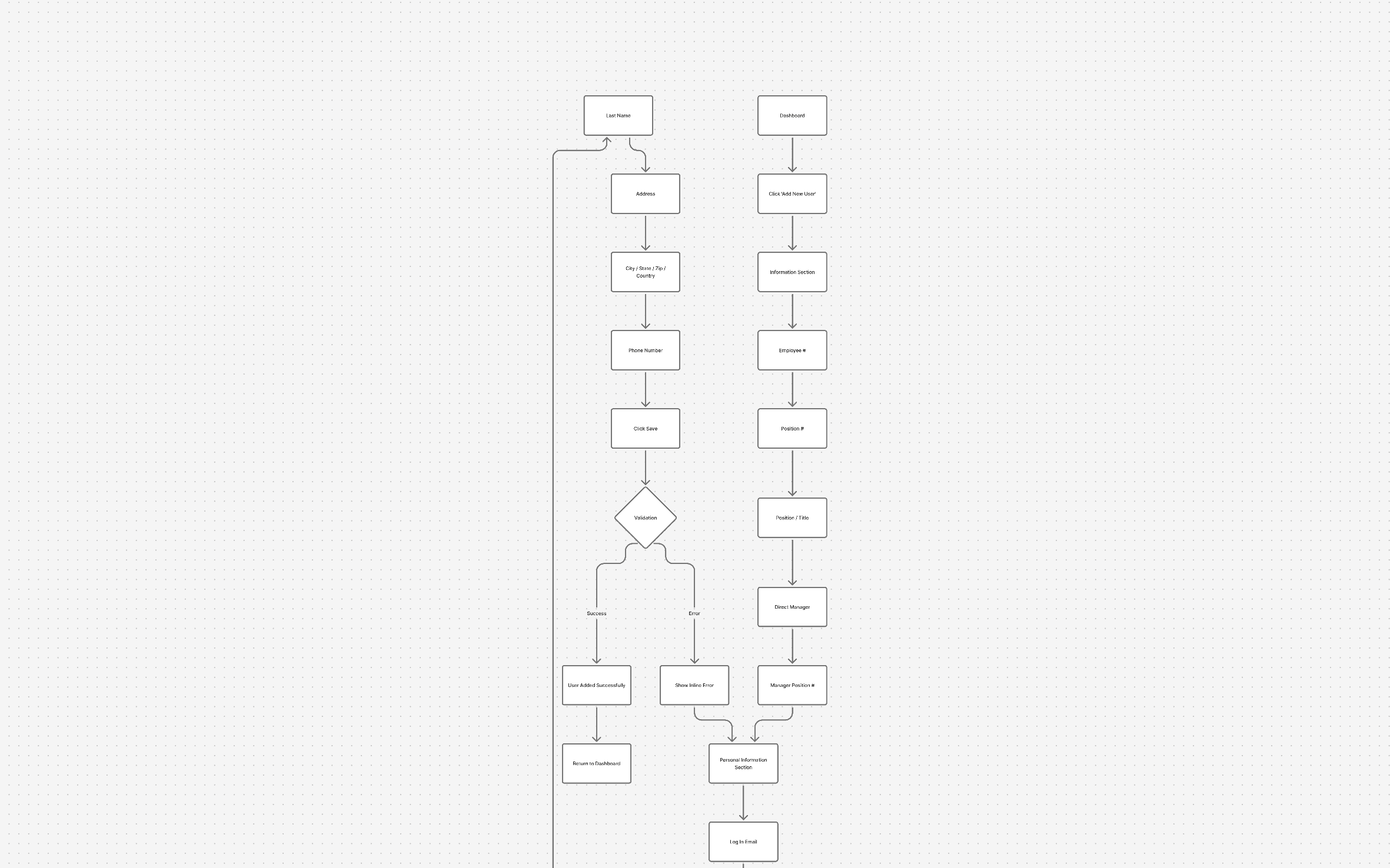
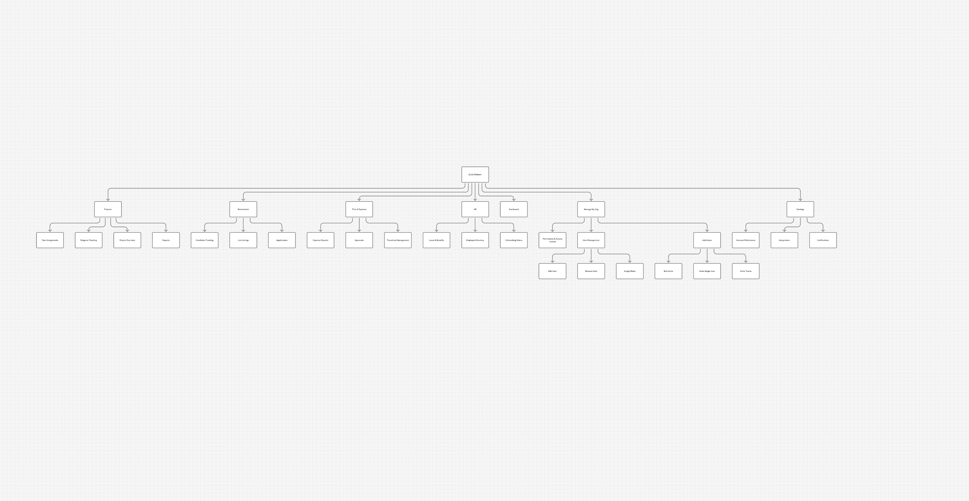
Start Collaborating with stakeholders to know more about their thoughts, and current user flow so how can i make better information Architecture from that
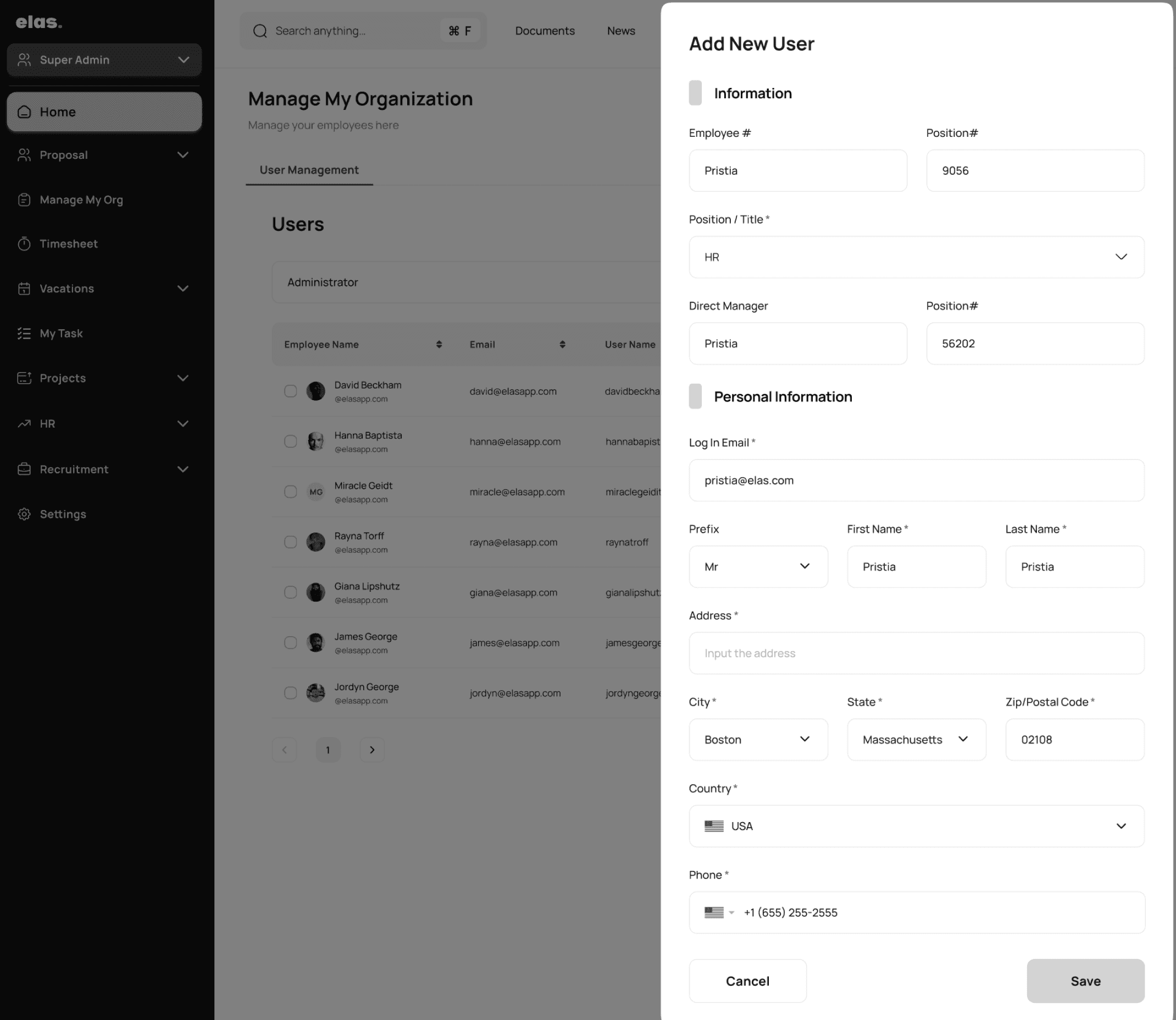
We modified the information architecture based on data, Reducing the form from 32 fields to around 12 made the process visibly simpler and less intimidating,
We modified the information architecture based on data, Reducing the form from 32 fields to around 12 made the process visibly simpler and less intimidating,
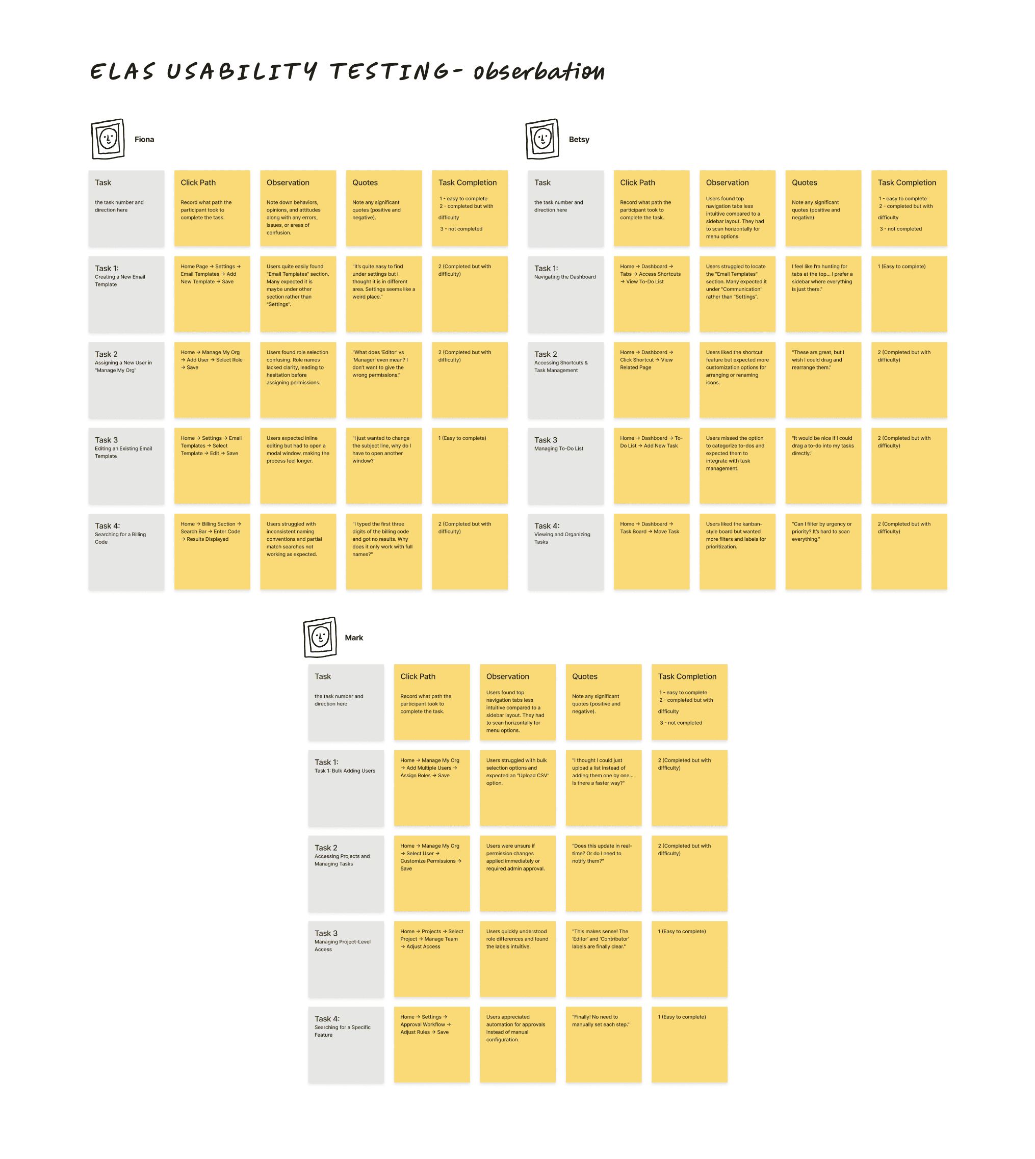
Observation
Patterns Identified:
Users prefer sidebar navigation over hide top tabs for better discoverability.
Bulk user management is expected, with CSV upload or multi-user selection.
Role labels are unclear, causing hesitation in assigning permissions.
Observation
Insight Identified:
Implement a sidebar layout for easier navigation
Add bulk user actions to streamline onboarding.
Clarify role permissions with tooltips or descriptions.
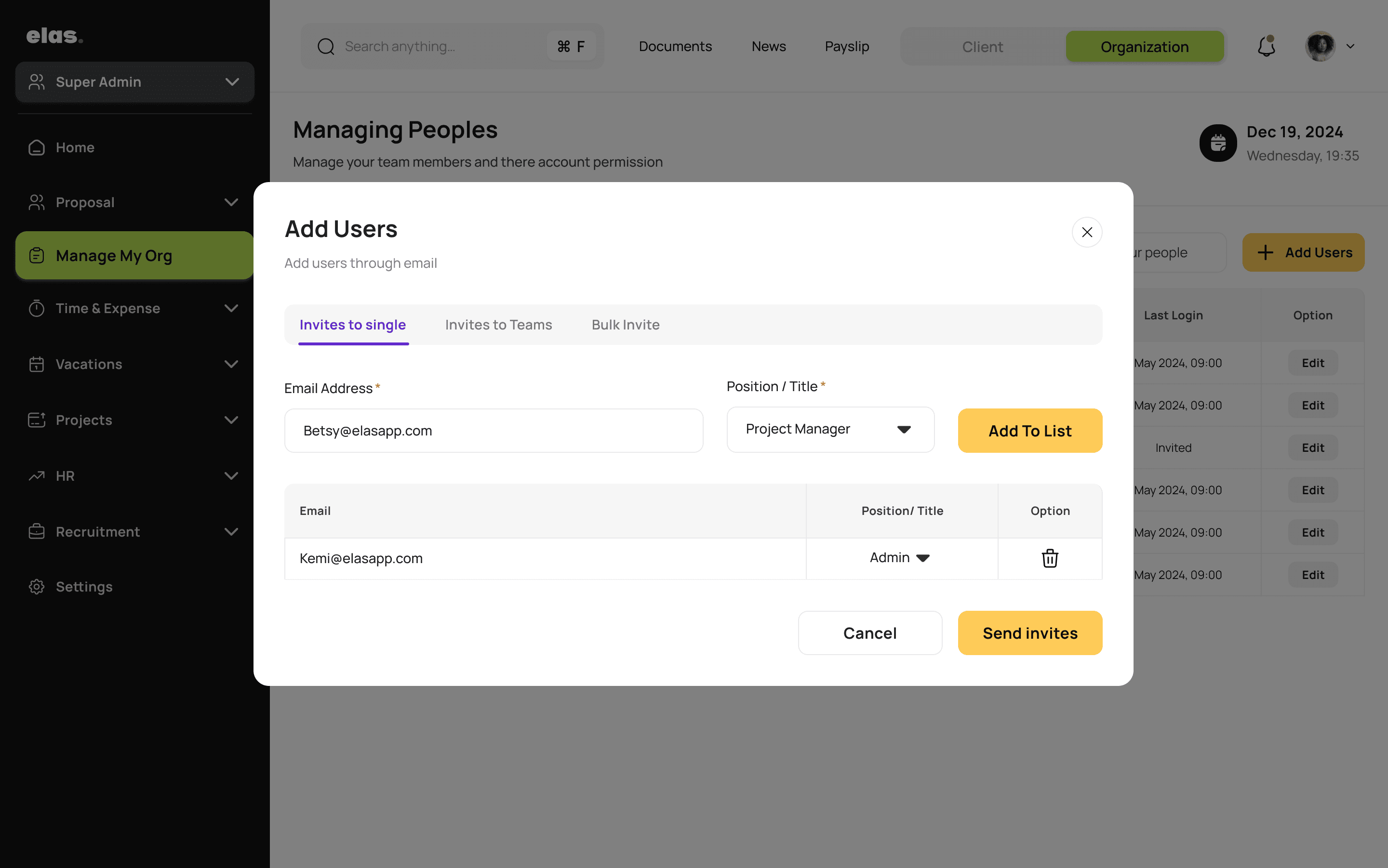
Shifting from a 12-field manual form to a 2-field invite flow drastically reduced friction for managers. Instead of filling every user detail, they now only enter an email and role — the system handles the rest.
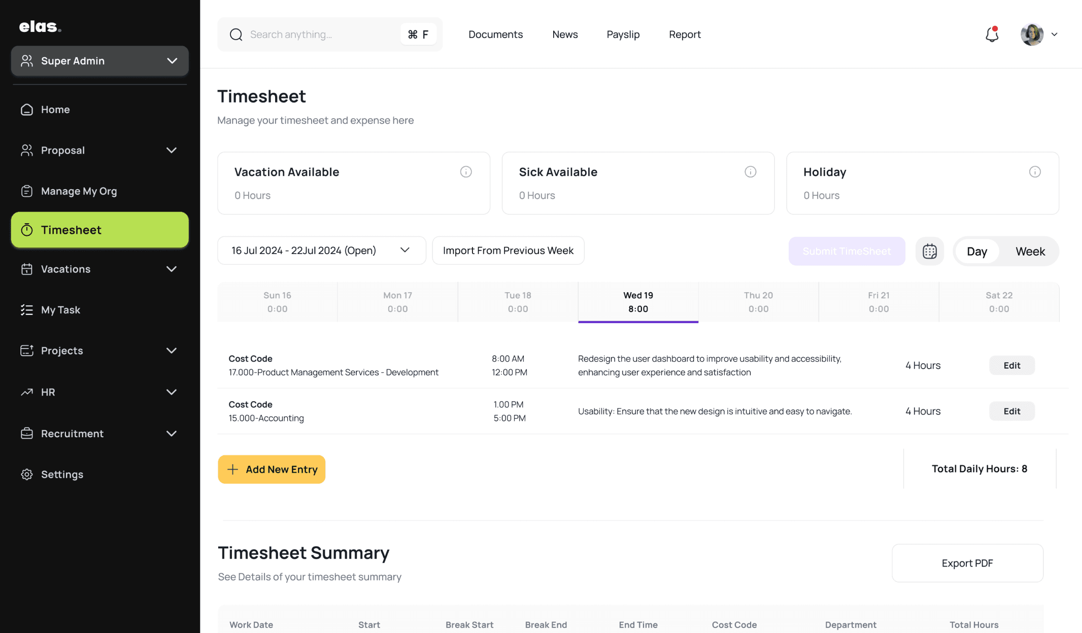
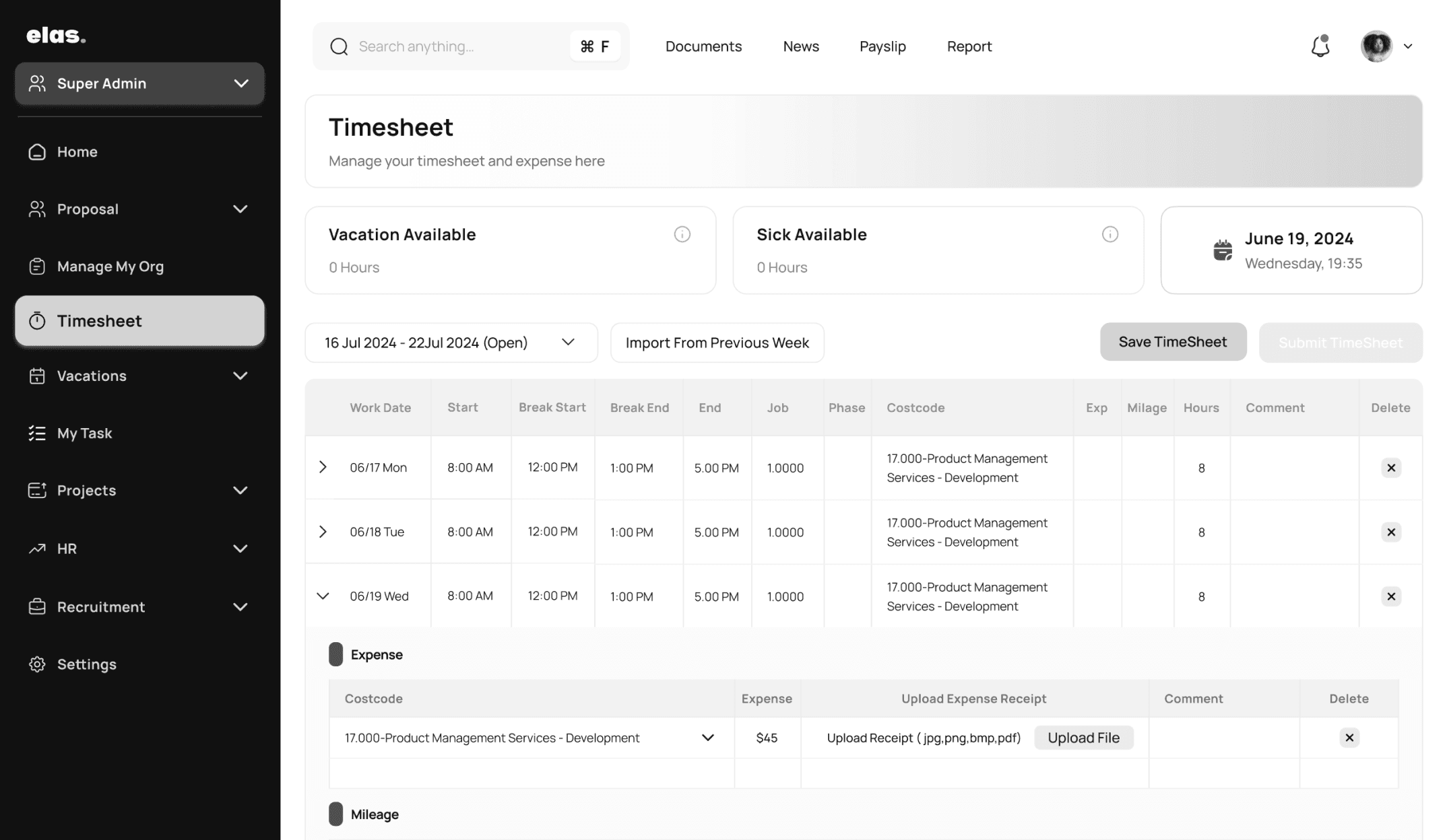
During testing, we found that users often struggled to review or edit specific day entries within the weekly timesheet. Based on this feedback, we introduced a Day/Week toggle, allowing users to switch views easily. This small change greatly improved navigation, clarity, and overall task efficiency.
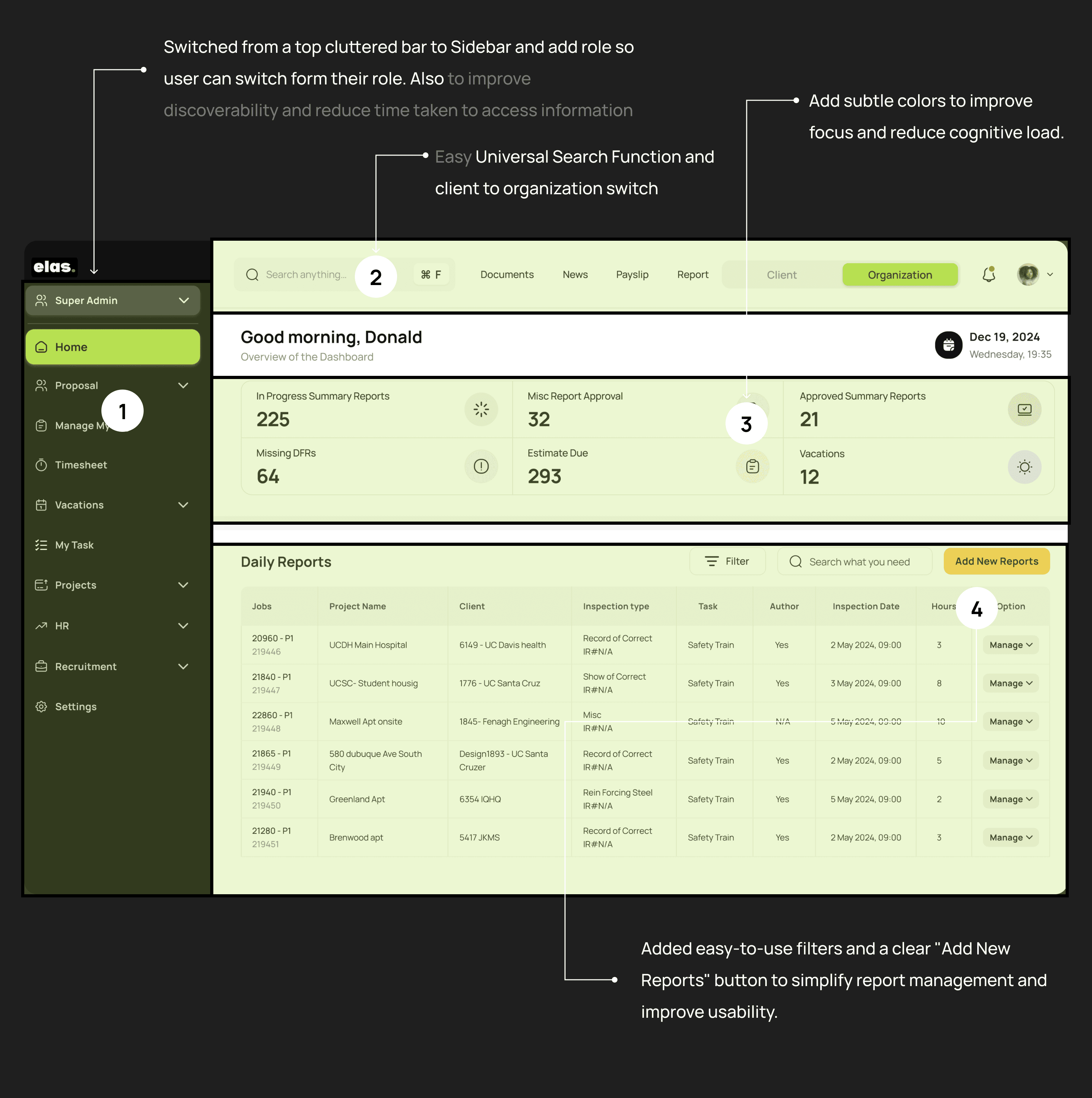
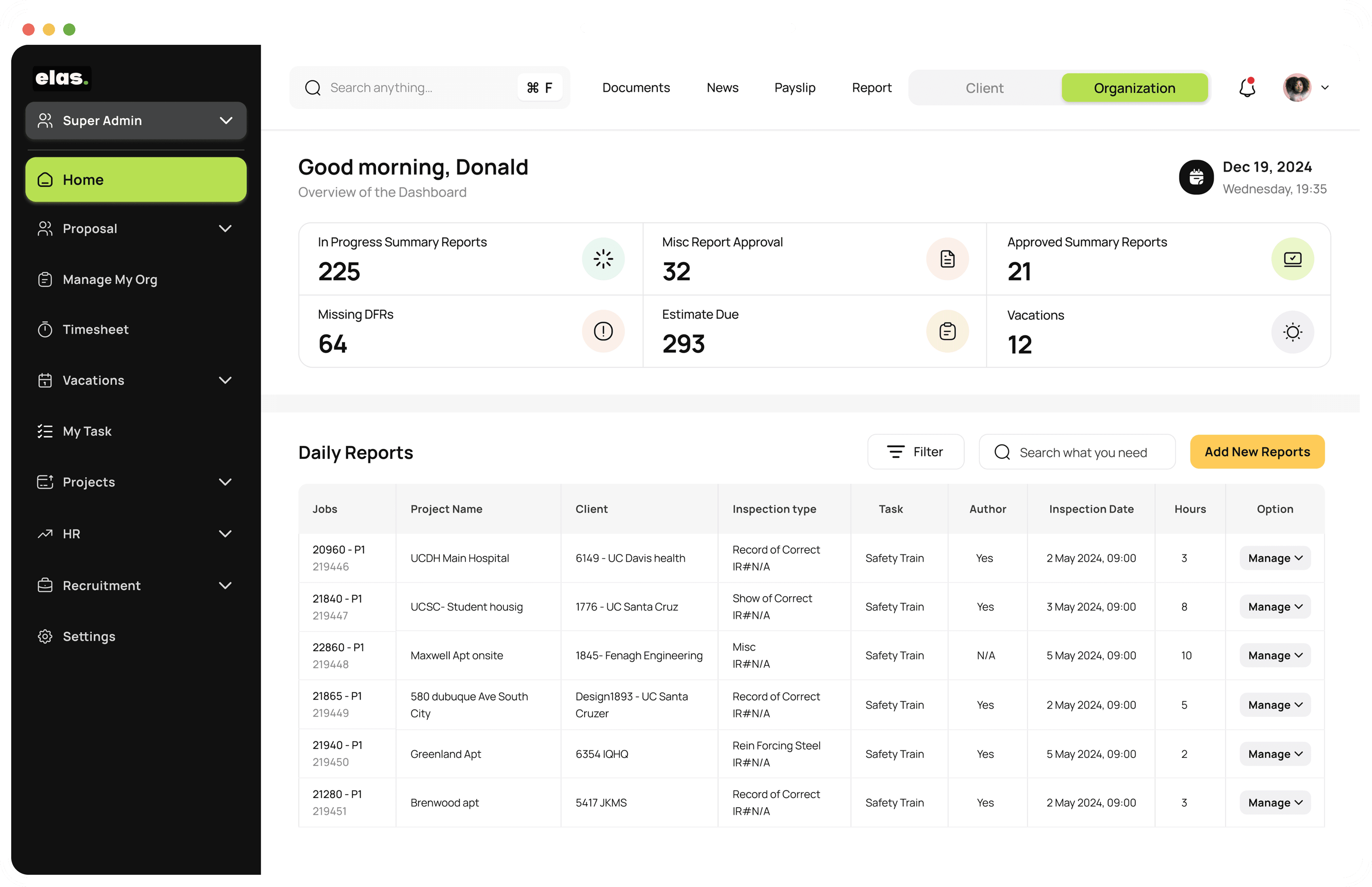
New Home
During user testing, we found that users already had an established mental model of how the platform should work. Based on this insight, we redesigned the Home page to better align with their expectations.
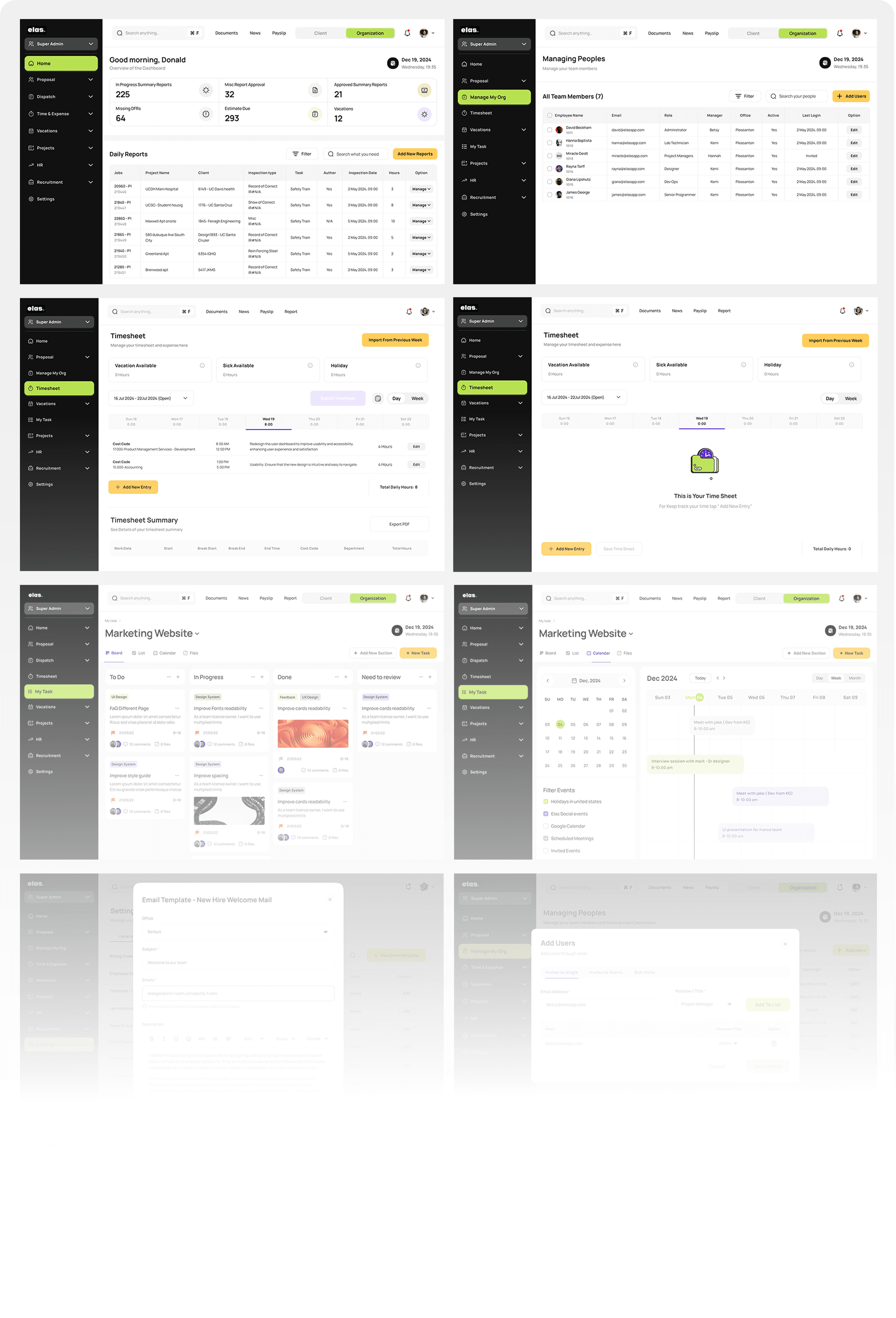
Final Product
Dev Handoff
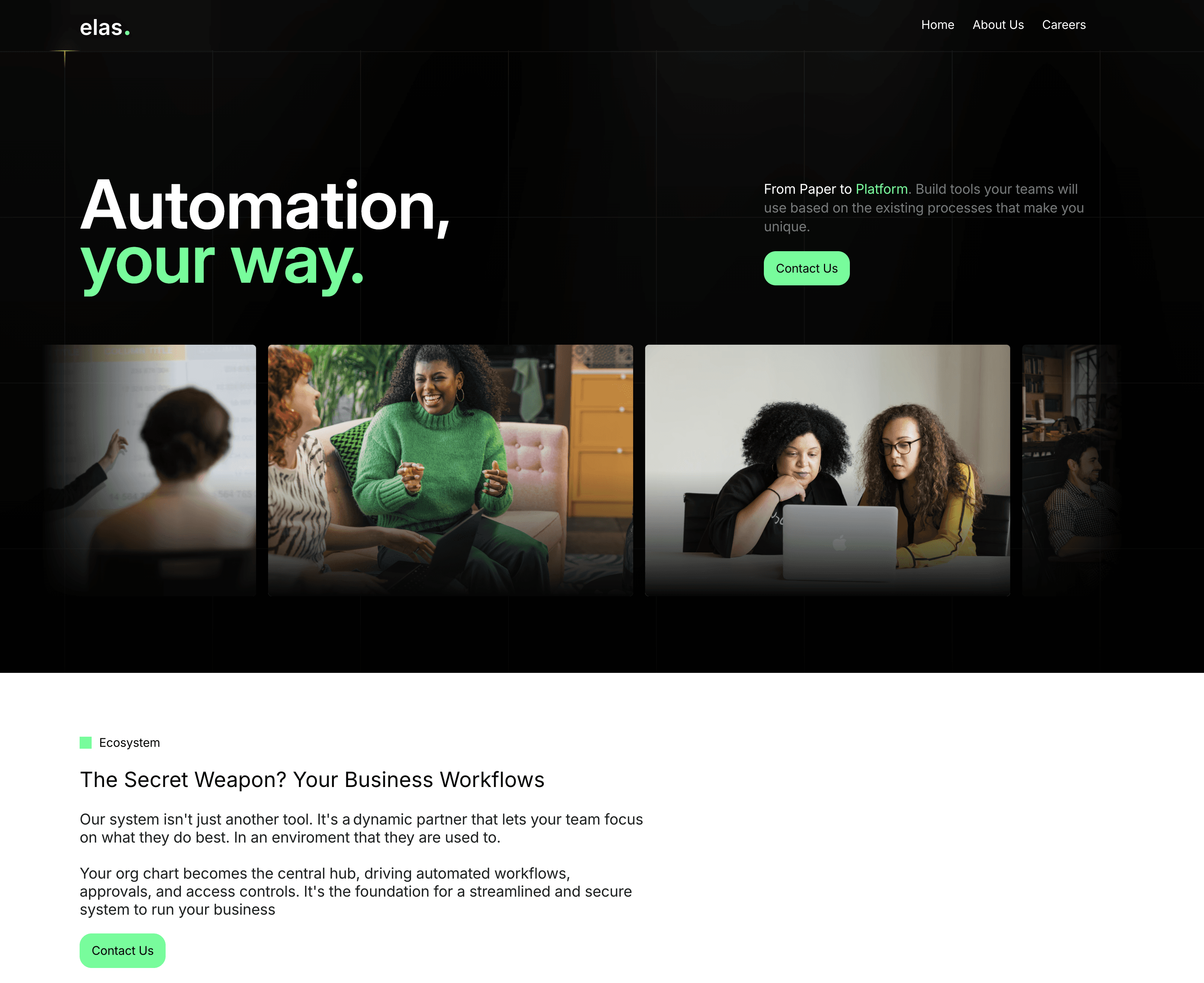
We crafted the new Elas home page to better reflect the brand’s vision and enhance user engagement. Starting from scratch, the design prioritizes clarity and modern aesthetics while ensuring seamless navigation. The headline, “Automation, your way,” conveys the core message, paired with visuals that resonate with the target audience.
Design
New Website from Scratch
Design
New Website from Scratch
Design
What I Learned
Ner website
new website
Mental Models Matter
Testing showed that users already had clear mental patterns from similar tools. Aligning the design with those expectations made the experience smoother and easier to use.
User Feedback Changes Everything
Watching users interact with the prototype revealed gaps I didn’t anticipate, helping me design for real behavior instead of assumptions.
Iteration is Key
Not everything that works in wireframes works in real life — refining based on user behavior made the product more intuitive.
Long-Term Iteration
I couldn’t stay involved through multiple testing cycles. With more time, I would’ve continued refining the design to ensure lasting impact and consistency.
Reduce Friction in Daily Workflows
Users can quickly switch between boards, lists, and calendarsstaying productive without losing context.
Reduce Cognitive Load
The redesign of the ELAS onboarding system drastically improved efficiency and user experience. By reducing the number of input fields from 32 to just 2,
Simplify Process
Make it fast and easy for managers to add large teams without repetitive manual steps
Reduce time
Clarify navigation and workflows so users can complete tasks without hesitation.
Increase adoption
Encourage every stakeholder to use the platform confidently through a clear, intuitive experience
“I spend too much time just finding the right section to approve reports. It should be more intuitive and faster.”
Project Manager
“I spend too much time just finding the right section to approve reports. It should be more intuitive and faster.”
Project Manager
“I spend too much time just finding the right section to approve reports. It should be more intuitive and faster.”
Project Manager
“I spend too much time just finding the right section to approve reports. It should be more intuitive and faster.”
Project Manager
Testing Design
To validate early design decisions, I conducted usability testing with low-fidelity wireframes. The goal was to assess navigation efficiency, task discoverability, and overall usability before moving to high-fidelity designs.
Major improvements in the design
To better understand the challenges users faced on the old Elas platform, i applied the “5W and H” framework. This helped us focus our research by asking key questions.
Start with “5W and H” framework (Who, What, Where, When, Why, and How)
User Feedback Changes Everything
Watching users interact with the prototype revealed gaps I didn’t anticipate, helping me design for real behavior instead of assumptions.
Long-Term Iteration
I couldn’t stay involved through multiple testing cycles. With more time, I would’ve continued refining the design to ensure lasting impact and consistency.

Start Collaborating with stakeholders to know more about their thoughts, and current user flow so how can i make better information Architecture from that
Users struggled to find key actions due to cluttered top navigation.
Overcrowded Interface with Information Overload
Increase adoption
Encourage every stakeholder to use the platform confidently through a clear, intuitive experience
Results
Status
Shipped
Website




Recovery is Holistic
Healing isn’t just physical — sleep, nutrition, and emotion shape recovery too.
Community Builds Motivation
Shared progress turns isolation into encouragement and accountability.

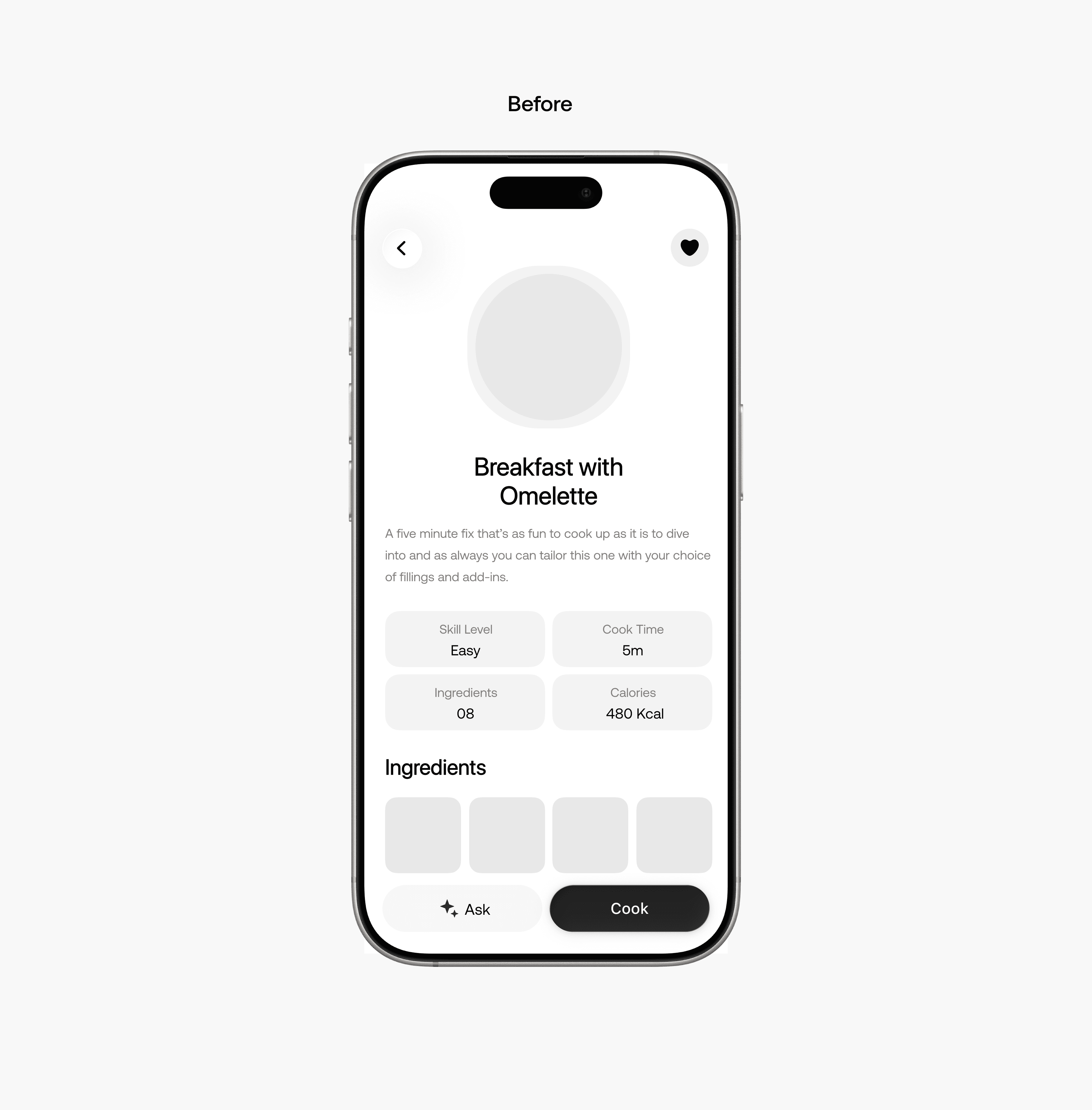
Major improvements in the design
During wireframe testing, users struggled to interpret their daily recovery progress and felt less motivated to track it. The next iteration emphasized clarity, focus, and real-time feedback.
What I Learned
What I could have done better
More Iterative Testing
Testing across all recovery phases could refine personalization further.
Broader Inclusivity
Involving users with diverse routines and lifestyles would widen insights.
The product
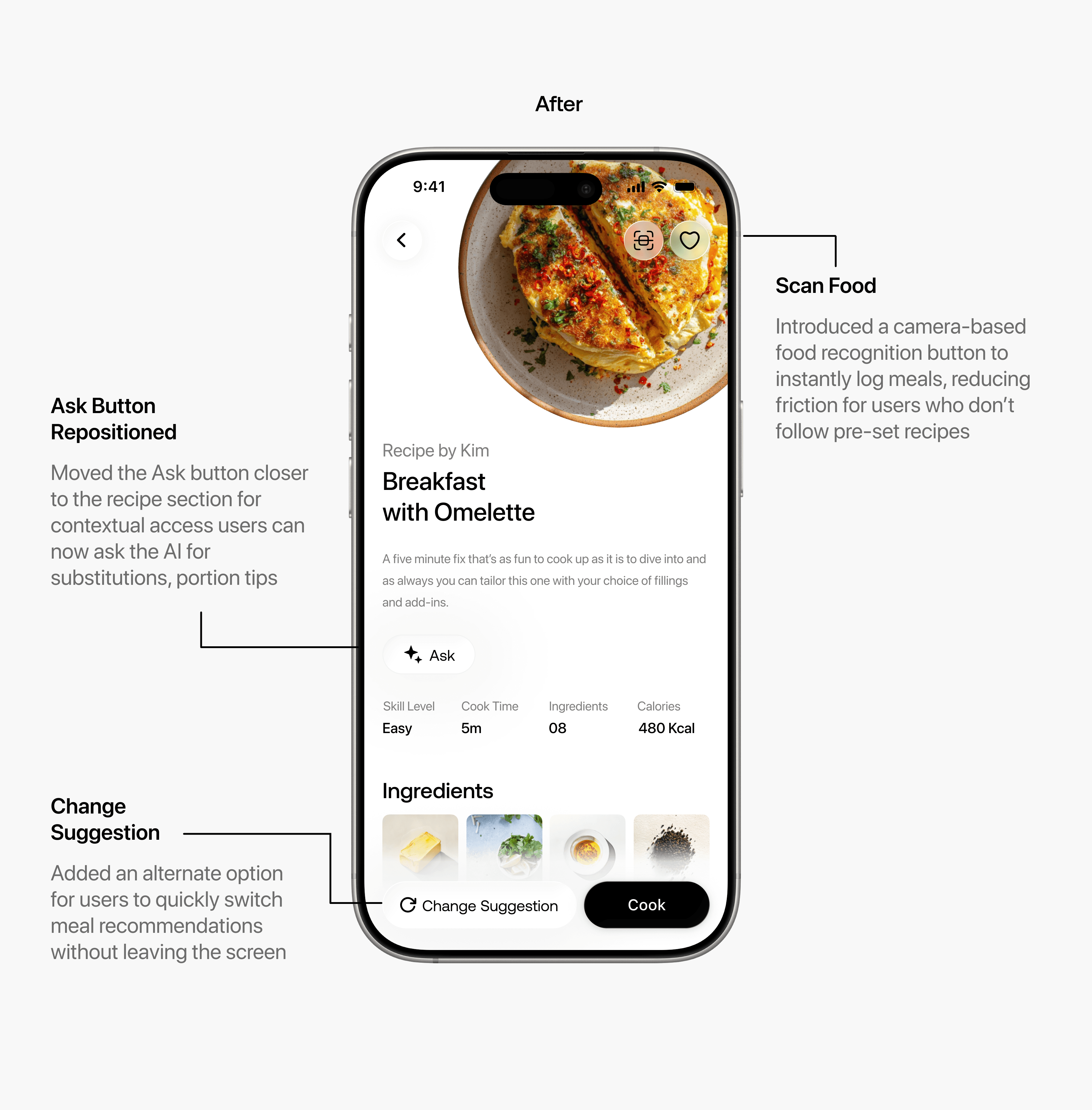
After user testing, the food screen was updated to add “Scan Food” for instant meal logging and “Change Suggestion” for flexibility. The “Ask” button was repositioned for contextual support, allowing users to get advice or alternatives while viewing a recipe
Align
ACL recovery takes 9 to 12 months. Most of it happens alone in a living room, with no idea if you’re doing it right.
I led product design and research for Align, a recovery companion that helps ACL patients stay consistent through the long, unsupervised stretch between clinical visits.
Role
Product Design & Research
Timeline
June 2025 - Sep 2025
Advisor
Dr. Arnold Mages
Problem
Each year, roughly 200,000 ACL injuries occur in the U.S., carrying an estimated lifetime burden of $7.6 billion. And while 91% of patients expect to return to their sport, only 65% reach their pre-injury level and fewer than 55% ever compete again
Results
Accelerator Funding & Partnership
with AirHealth
Validated through 2 rounds of user testing, where users showed strong interest in real-time movement guidance. Secured partnership with health-tech startup AirHealth, which raised $600K in accelerator funding to develop Align commercially. Beta launch in August 2026.
Recovery made simple, see the progress, stay consistent, and eat better without the guesswork.
Recovery made engaging
Detects flexion & extension angles instantly
Real-time voice & visual cues
Turns every rep into a progress game
Intelligence
Speak freely about recovery food, sleep, or pain
Voice-based journaling for emotional and physical trackingTurns
A safe, intelligent space that listens without judgment
Feel better,
Move smarter.
Align helps user rebuild the routine after an ACL injury not just physically, but as a whole person. With movement tracking, gentle food and sleep nudges, and daily wellness reflections, Align keeps your progress steady and your habits aligned
Rebuild

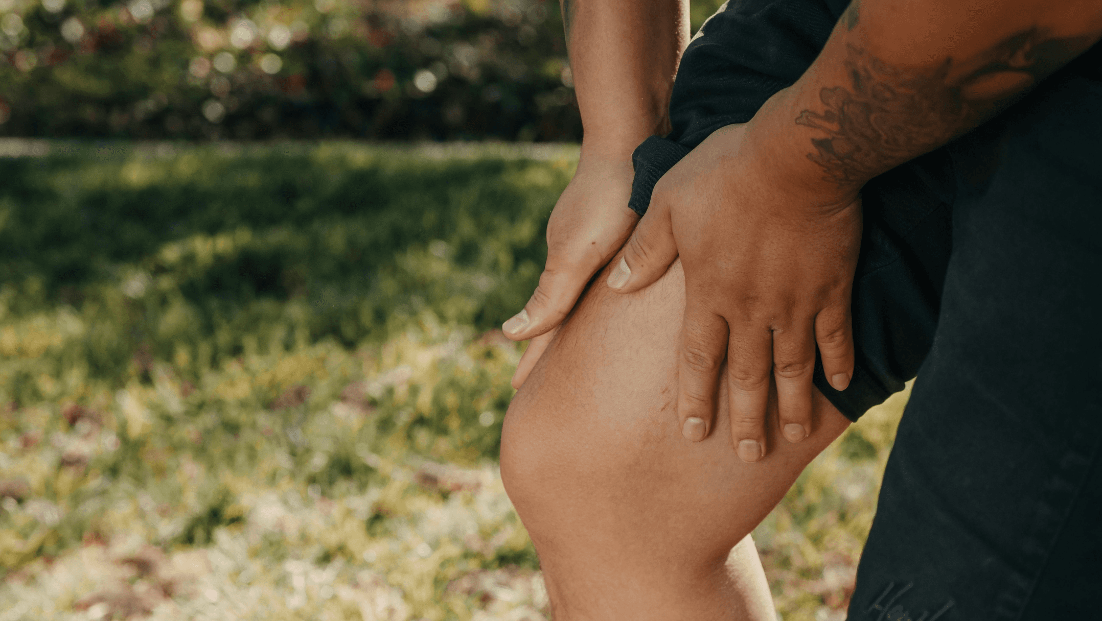
The assumption
What I thought I was building
People finish PT, go home with a sheet of exercises, and stop. So the fix looked obvious: a better tracker. Clearer instructions, smarter reminders. I was wrong, and the research is what caught me. This is mostly a case study about that correction.

Observed sessions
Observing recovery
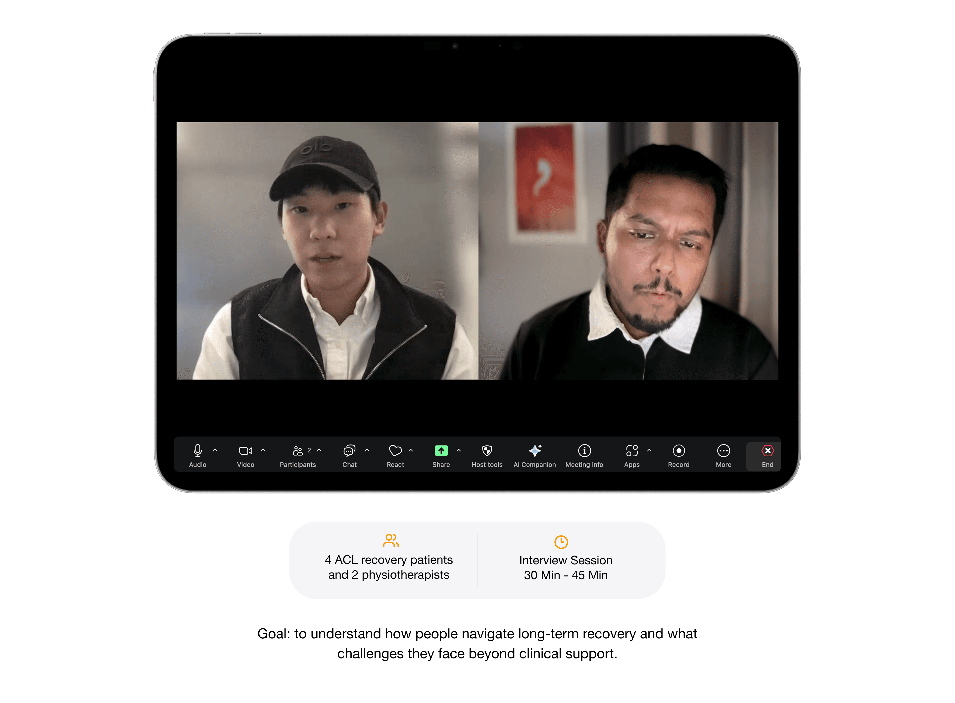
I talked with 4 ACL patients and had them walk me through their recovery exercises while I watched and asked questions
Listen
Understanding
Why it breaks down
After obsevering patients, I interviewed two physiotherapists to understand what makes recovery break down once structured PT ends and why so many people stop
Mapping the Research
I also explored ACL recovery groups on Reddit and other online spaces to hear real stories from people in recovery. Their posts revealed honest emotions, frustration, fear, and small wins. That helped me see what recovery really feels like beyond the clinic
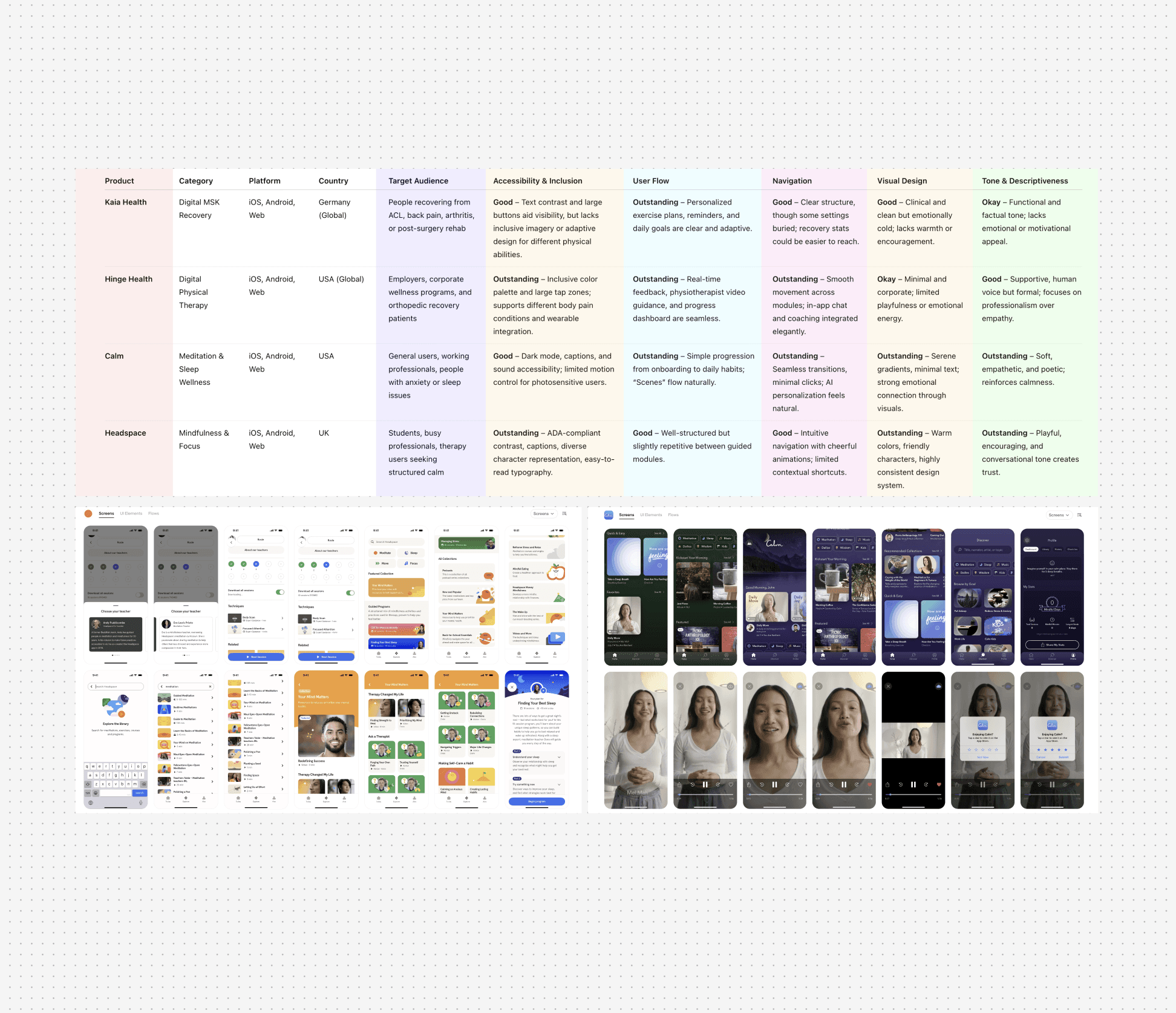
I compared existing recovery and wellness apps like Kaia Health, Hinge Health, Calm, and Headspace to identify gaps.
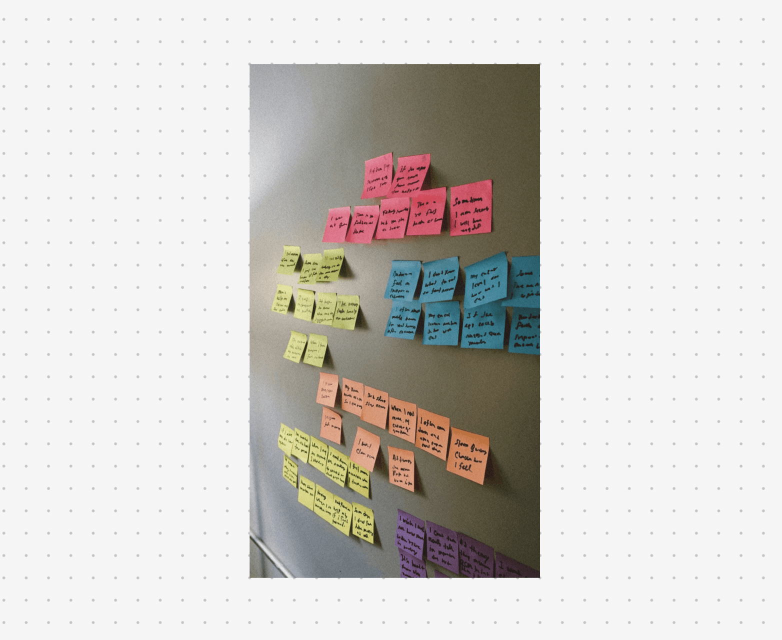
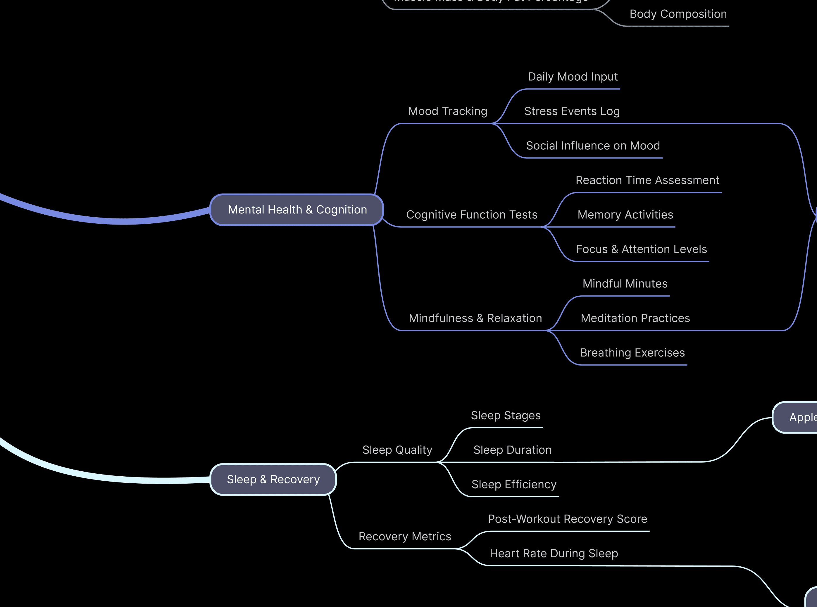
And I mapped all qualitative insights from interviews, Reddit discussions, and app audits into an affinity map.
Physiotherapist
“Most patients give up after a week.”
It’s not that they don’t care, it’s just hard to stay consistent without clear feedback.
Physiotherapist
“Most patients give up after a week.”
It’s not that they don’t care, it’s just hard to stay consistent without clear feedback.

Findings
key themes
& opportunity
Motivation & Consistency
Users begin recovery with enthusiasm but lose drive after the initial phase, especially when progress feels slow.
Fragmented Health Tracking
Users juggle multiple apps for exercise, sleep, and nutrition.
Emotional Support Gap
Patients struggle through their hardest moments alone, current apps measure pain but can’t understand it
Synthesizing
into Archetypes
After identifying key themes, I synthesized user insights into three behavioral archetypes that represent how people approach recovery, balance, and habit formation. These archetypes helped me design with empathy
Archetype #1
The Determined Tracker
Goal-oriented and structured. Tracks every rep, step, and meal. Wants to stay motivated throughout the journey.
Archetype #2
The Emotional Healer
Values reassurance and self-kindness. Recovers through rest, reflection, and support. Motivated by encouragement and community.
Archetype #3
The Guided Learner
Seeks expert-backed structure. Wants to do things right, but depends on clear guidance and consistency cues
Synthesizing
into Archetypes
After identifying key themes, I synthesized user insights into three behavioral archetypes that represent how people approach recovery, balance, and habit formation. These archetypes helped me design with empathy
Archetype #1
The Determined Tracker
Goal-oriented and structured. Tracks every rep, step, and meal. Wants to stay motivated throughout the journey.
Archetype #2
The Emotional Healer
Values reassurance and self-kindness. Recovers through rest, reflection, and support. Motivated by encouragement and community.
Archetype #3
The Guided Learner
Seeks expert-backed structure. Wants to do things right, but depends on clear guidance and consistency cues
Problem Statement
Once ACL patients leave physical therapy, they recover alone for months — unsure if they're improving, unsure if their form is right, unable to see how daily habits affect their progress. Without that visibility, motivation fades, and many stop before they've fully recovered.

HMW Statement
How might we help ACL patients stay consistent at home by making their recovery progress easier to see?
HMW Statement
How might we help ACL patients stay consistent at home by making their recovery progress easier to see?
Product Strategy
Based on the research, I defined three product pillars.
1. Make progress visible
Patients need evidence that recovery is happening, even when it's slow so Align surfaces recovery metrics and daily progress.
2. Guide the next action
Patients shouldn't have to interpret raw data alone so Align turns it into one clear focus for today.
3. Support the recovery loop
Recovery isn't only physical so Align connects movement, sleep, food, and emotional state in one place without overwhelming.
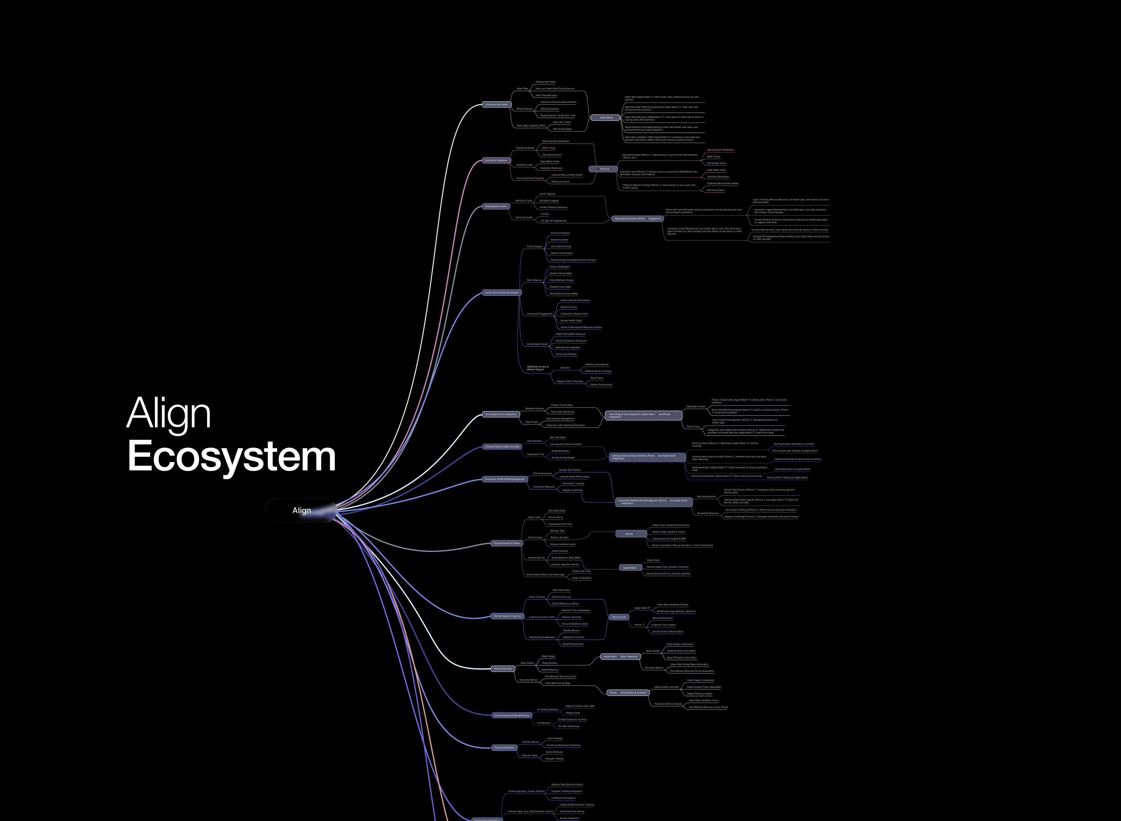
Once the strategy was clear, I mapped how physical, lifestyle, and emotional recovery data could connect across the product
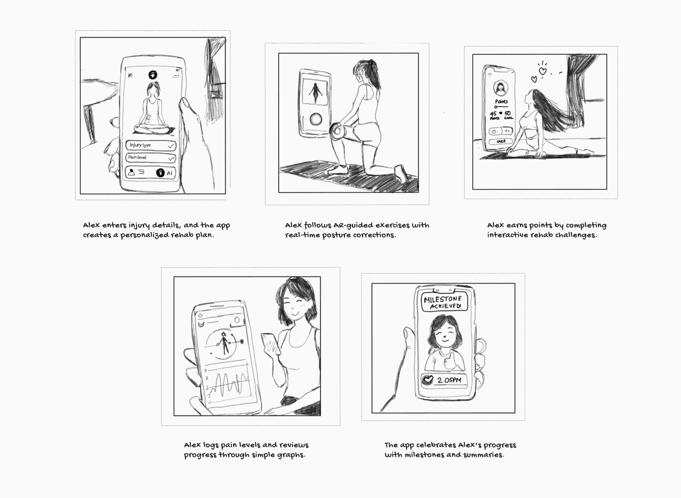
Testing
Research to
validate design
The goal was to ensure that users could set up their recovery phase, log progress, and navigate between physical, mental, and nutrition tracking without confusion.
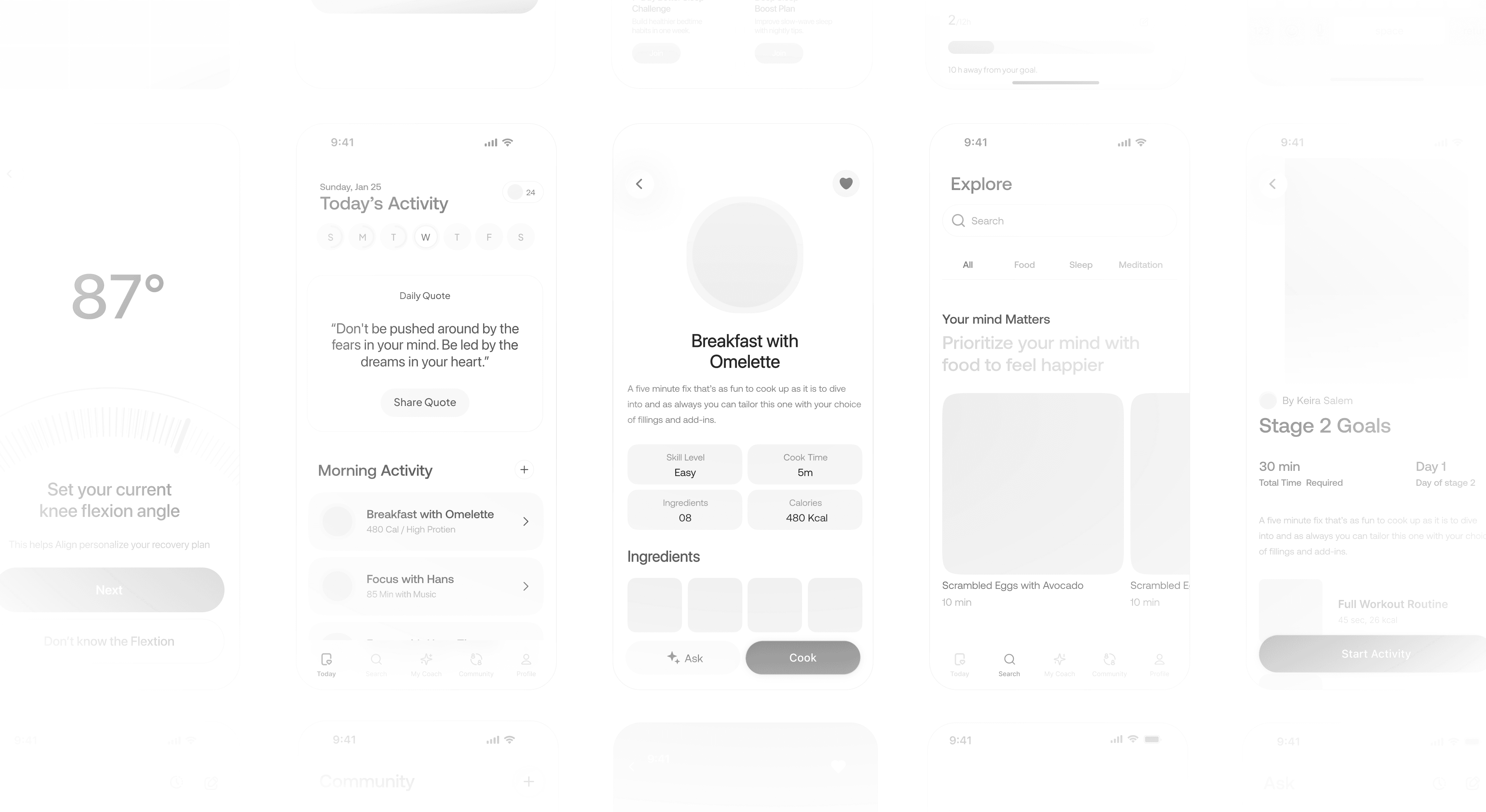
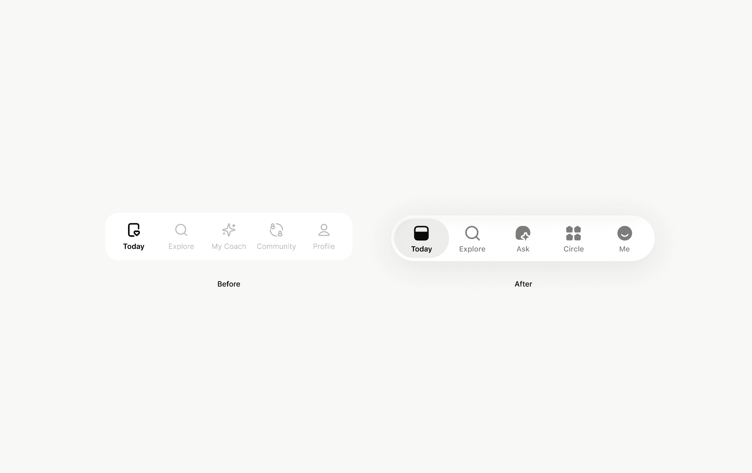
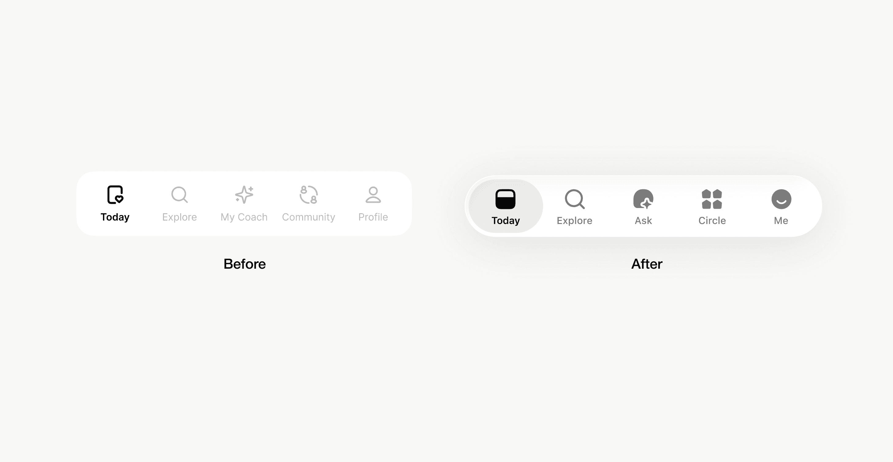
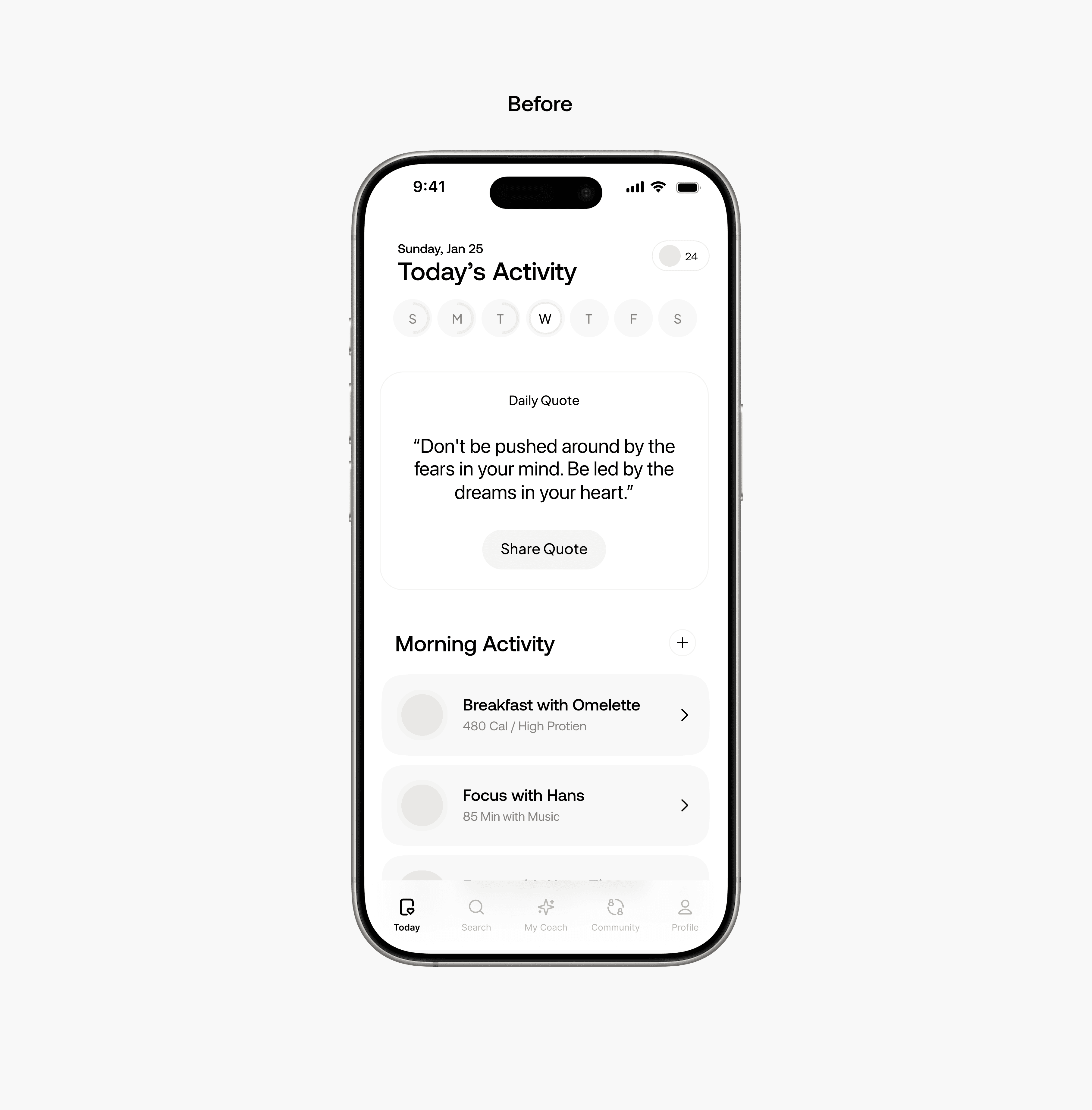
After user testing, the navigation was redesigned in an iOS 16/17-style floating layout, creating a softer, more modern appearance. The new tabs Today, Explore, Ask, Circle, Me are simplified and renamed for clearer mental mapping


0-1 Development with AirHealth
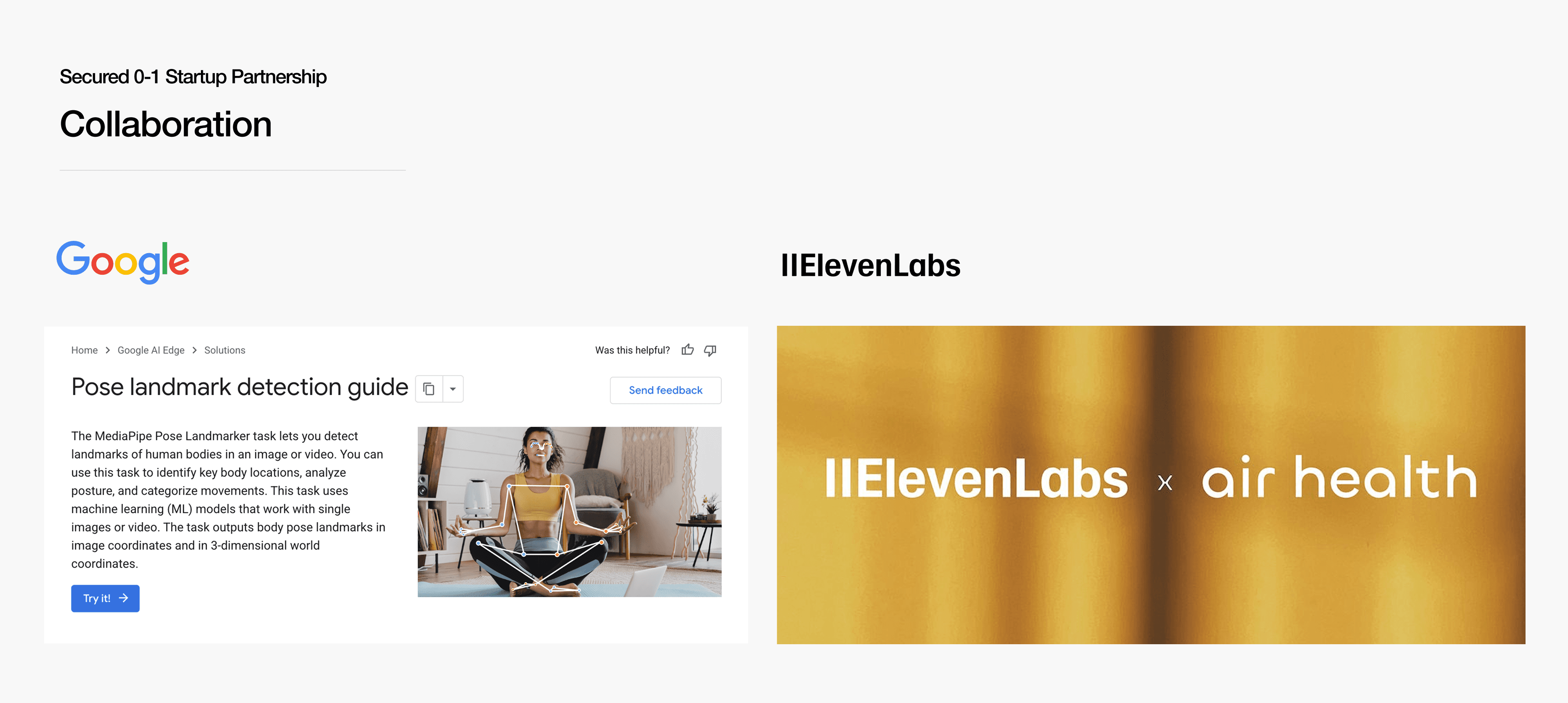
I partnered with AirHealth to engineer the MVP for real-world release. The technical architecture leverages Google MediaPipe for precise on-device motion tracking and ElevenLabs to deliver empathetic, human-like voice guidance.
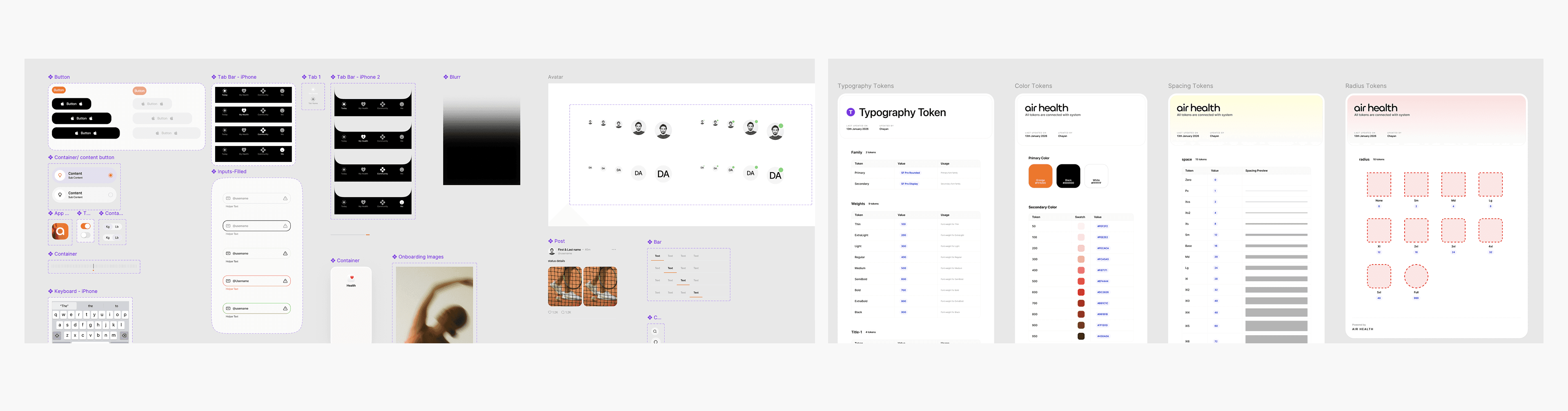
Scalable Design System & Tokens
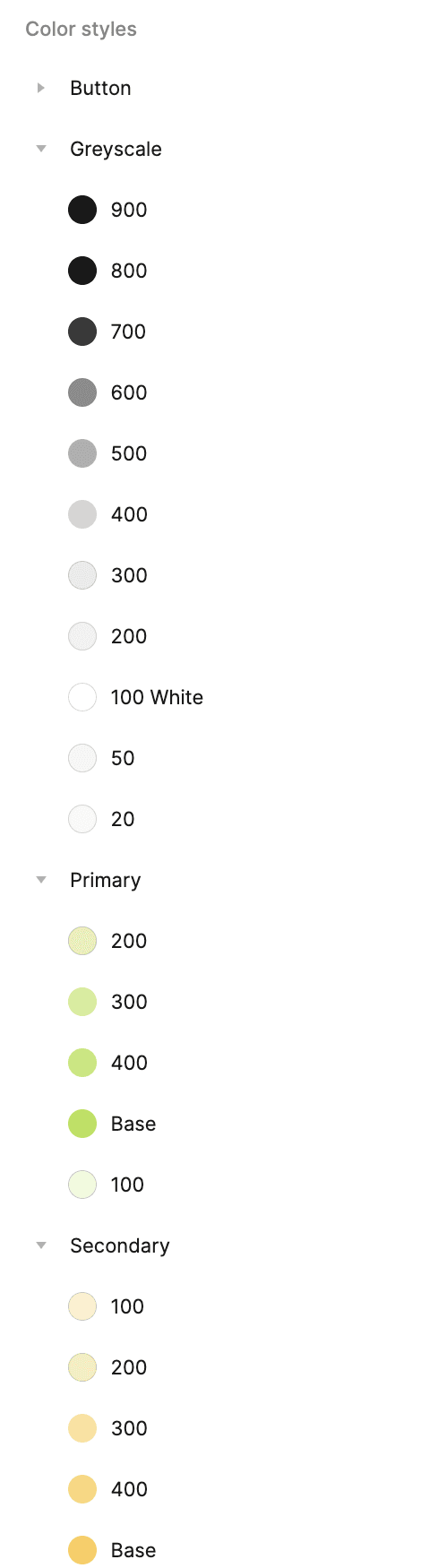
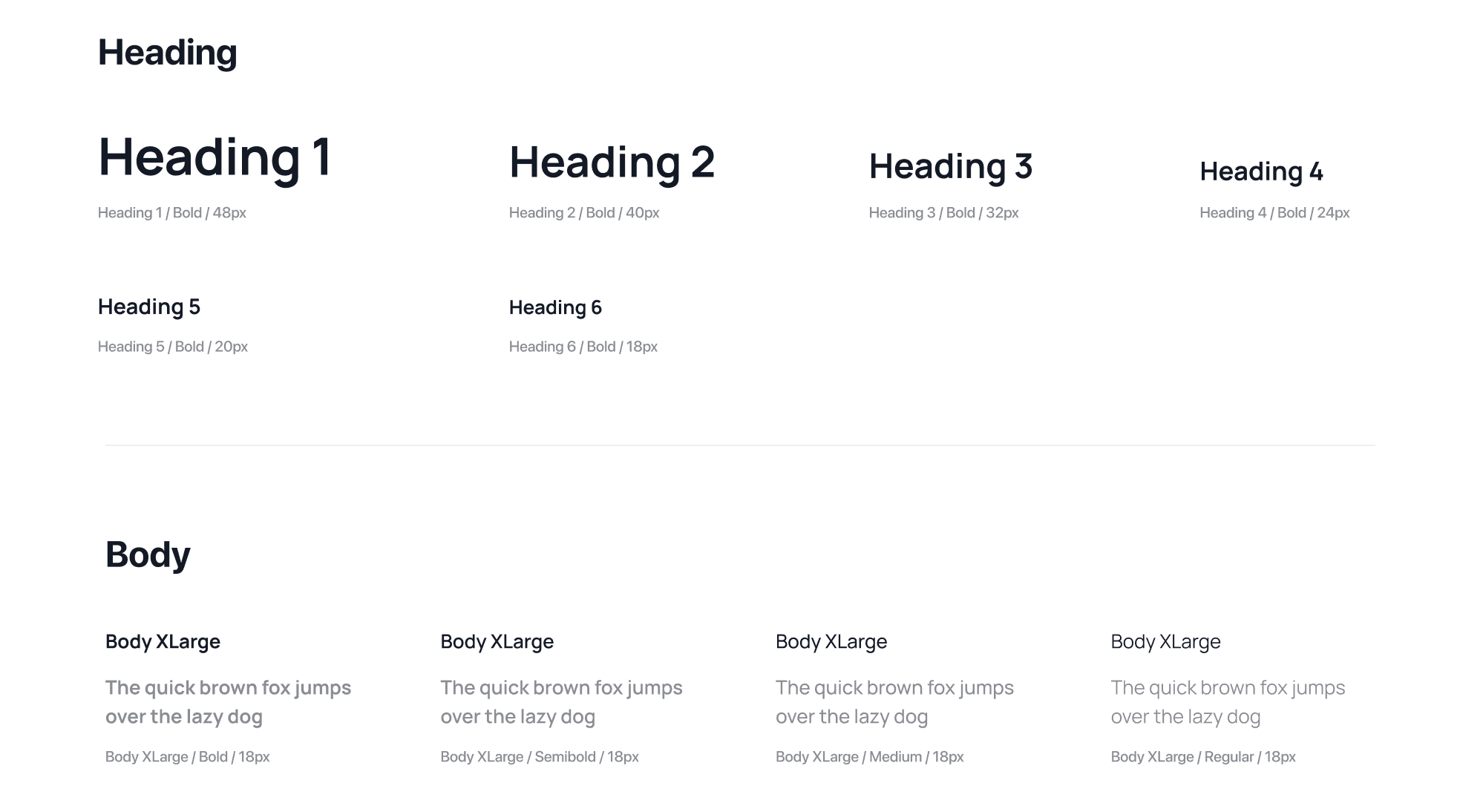
To support AirHealth’s rapid development, I moved beyond static components to a semantic token architecture. This system maps design variables directly to code, ensuring seamless engineering handoff and 1:1 implementation accuracy for the MVP